| |||||||
| Search Forums |
| Advanced Search |
| Go to Page... |
 |
| Search this Thread |  23,945 views |
| | #1 |
| BHPian Join Date: Jun 2011 Location: Pune
Posts: 266
Thanked: 116 Times
| A companys brand is its most important asset. A brand is a leadership tool. A brand defines your business, products and services you offer. It is a guarantee of quality. Your brand helps your business establish a relationship with customers and define your position in the market. The brand makes a promise to customers and key stakeholders that must be delivered at every touchpoint. There are a lot of fascinating stories associated with companies logo histories. Below we share logo stories of some of the biggest automobile companies today. Be sure to let us know if I have missed anything! 01. Alfa Romeo  Alfa Romeo, the Italian car manufacturer, traces its beginnings to France. The company was initially founded as Società Anonima Italiana Darracq (SAID) in 1906 by the French automobile firm of Alexandre Darracq, with some Italian investors. After the partnership failed, one of the investors, Cavaliere Ugo Stella, moved the company and renamed it as Anonima Lombarda Fabbrica Automobili (Lombard Automobile Factory, Public Company) or A.L.F.A. The first logo of ALFA was designed in 1910 by Romano Cattaneo, and has an interesting story. He was once waiting for a tram at the Piazza Castello station in Milan, when he was inspired by the Red Cross on the Milan Flag and the Coat of Arms of the Noble House of Visconti (the coat of arms featured a grass snake, biscione, with a man in its jaws, symbolizing [to the] Viscontis enemies that the snake [was] always ready to destroy). The words ALFA and MILANO were written around the two symbols separated by two Savoia Dynasty Knots, to honor the kingdom of Italy. In 1916, Neapolitan businessman Nicola Romeo bought the company and converted its factories to produce munitions and machineries for World War I. In 1918, the badge was redesigned by Giuseppe Merosi, to include the words ALFA and ROMEO (after the name of the owner Nicola Romeo). Post war, the company went back to producing car and was named after its owner as Alfa Romeo. 02. Aston Martin 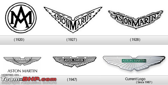 Aston Martin is a British manufacturer of luxury sports car, which was found by Lionel Martin and Robert Bamford in 1913. Initially, the duo started to sell sports car made by Singer but later decided to make their own vehicles. Their first car was named Aston Martin, after the name of the owner Lionel Martin and the Aston Clinton Hill Climb Racing Course (one of their Singer cars, they sold earlier had won a race there). In 1959 James Bond happened, and frankly the Aston Martin story cannot be told without Mr. Bond. In 1959, Ian Fleming put the super spy James Bond in an Aston Martin DB Mark III. When the movie was released in 1964, James Bond drove the upgraded supersleek silver Aston Martin DB5 in Goldfinger (1964) and Thunderball (1965) (complete with machine gun, passenger ejector seat, and revolving number plates!). 03. Audi  Audi is a German brand which produces cars and is a part of the Volkswagen Group. The company was founded as A. Horch & Cie by August Horch in 1899, and its origin has a very interesting story. August Horch, a German Engineer, was forced out of his own company in 1909, after which he continued to use the old brand name of Horch. However, his partner sued him for trademark infringement, and Horch was forced to look for a new name. During a meeting at his business partner Franz Fikentschers apartment, Franzs son came up with the name Audi (which is a Latin translation of Hoch, which means listen): During this meeting Franzs son was quietly studying Latin in a corner of the room. Several times he looked like he was on the verge of saying something but would just swallow his words and continue working, until he finally blurted out, Father audiatur et altera pars wouldnt it be a good idea to call it audi instead of horch?. Horch! in German means Hark! or listen, which is Audi in Latin. The idea was enthusiastically accepted by everyone attending the meeting. (Source: Wikipedia, A History of Progress (1996) Chronicle of the Audi AG) After this the company was named as Audiwerke GmbH in 1910. In 1932, four car makers Audi, Horch, DKW, and Wanderer merged to form Auto Union. The four interlinked rings that would later become the modern Audi logo, was originally the logo of the Auto Union. Initially the Auto Union logo was used only for racing cars and the four companies continued to produce cars under their own brands. Finally in 1985, the Auto Union became the Audi company we know today. in 2009, Audi introduced new logo which is also the current one. The modern Audi logo shows a three-dimensional texture and shadowing, resulting in a polished chrome look. The Audi name is now smaller, has moved away from the center to the bottom left corner, while the font has changed as well. 04. BMW  BMW or Bayerische Motoren Werke AG (Bavarian Motor Works) was originally founded as an aircraft company. The aircrafts manufactured were painted with the colors of the Bavarian flag, which is the color of BMW logo. Another explanation is that when the pilot used to sit in the plane he would see alternating segments of white and blue due to rotation the plane propeller (blue being the sky). The major business of BMW was to supply planes to the German army during World War I. But after the war they were forced to change their business. It made railway brakes, before making motorized bicycle, motorcycles and cars. The logo itself hasnt changed a lot during the years, but now has a more stylish look due to the different gradients. The unchanged logo has made it easier for people to remember and has given the company more recognition. 05. Buick 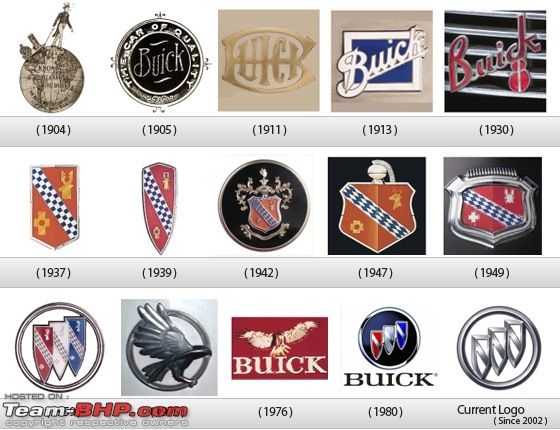 Buick Motor Company, which would later become the worlds largest auto company General Motors, was founded in 1903 by David Dunbar Buick, a high school dropout! Buick had dropped out of school at 15, to work for a plumbing fixture manufacturer. Buick and his friend took over the business, after the last owner decided to shut down the failed business. Buick sold his share in the company after an argument with his partner because he used to spend most of his time tinkering with car engines. With this money, Buick founded the Buick Motor Company and within a few years he ran it to the ground. Around 1904, James H Whiting took over the company and brought in William Durant to manage his acquisition. Buick was kicked out of the company by Durant and had to sell his share for just $ 100,000. Buicks share would be worth more than $ 100 Million today. Later Buick held low paying jobs, and died penniless as an inspector at the Detroit School of Trades. Ironically, Durant himself was kicked out of the company years later and denied him pension. He too died penniless. Before 1937, the companys logo was a variation of the cursive word Buick. In 1930s, Ralph Pew, a General Motors Styling Researcher, found the Scottish Buick familys crest and the company used that as its logo. In 1959, the company logo incorporated three such shields, one each for its three models at that time (LeSabre, Invicta, and Electra). In 1975, the company launched its Skyhawk line, and the company logo was changed to include a hawk named Happy. The familiar tri-shield logo returned in late 1980s when the company stopped manufacturing the Skyhawk car. 06. Cadillac  When Henry Ford left Henry Ford Company, the financial backers wanted to sell the companys assets. Cadillac was found in 1902, when an engineer, Henry M Leland, convinced the financial backers to hold on to the company assets. Cadillac was named after a minor aristocrat Antoine de La Mothe, Seigneur de Cadillac (Sir of Cadillac), and the family crest of de La Mothe was used as the first company logo back in 1906. Antoine de La Mothe, born in France, was forced to move to America, (some say he had committed a crime, others say he had a debt which he was unable to pay) where he assumed a new identity and formed his family crest by borrowing from different crests. In 1998, the company started redesigning its logo under the design philosophy called Art & Science. The new logo finally unveiled in 2002, didnt have the six birds (merlettes), crown and the crest resemblance, and looked like it was made by Piet Mondrian. in 2009, As part of the new marketing vice president Bob Lutzs campaign to revive and spin the GM image around, Cadillacs general manager, Bryan Nesbitt, revealed the brands new logo, in fact a very minor-tweaked version of the old one. 07. Chrysler  The Company was formed by Walter Percy Chrysler on June 6, 1925, with the remaining assets of Maxwell Motor Company. The original Chrysler logo, which vanished after 1954 from all but 1955-1956 Windsors, C300s, and 300Bs with manual transmissions*, and reappeared in 1994, is a rendition of a wax seal complete with ribbon affixed at the lower right. The thunderbolts above and below the name are actually Zs, a tribute to the prototype built before Chrysler took over Maxwell, which took the name Zeder from chief engineer Fred Zeder. (At the time, Chrysler was trying to keep development of the new car and his involvement in it a secret, probably still upset about the loss of the car that was supposed to be the first Chrysler. This car design was sold to Billy Durant as a liquidated asset in the Willys-Overland bankruptcy; Durant eventually built this car under the Flint name.) Starting in the 1980s, Chrysler adopted modernistic logos in print materials and on some car nameplates. During the rebirth of Chrysler in the late 1990s, the Chrysler seal logo was installed in wings. After Cerberus bought Chrysler, Trevor Creed was let loose on the traditional pentastar. Shortly after the Fiat takeover, Chrysler trademarked another new logo, based on a modernized wing design. [Read More..] In 2009, Chrysler redesigned its logo for their adorn cars, The look is sleeker and clearly more modern than the previous winged logo, which incorporated the old Chrysler seal. The new one has an almost Aston-esque (Aston Martin) vibe to it, featuring Chrysler embossed in a blue emblem centered between the outstretched wing. 08. Citroen  Citroen double arrow that is found in every logo Citroen has a fascinating history. Brand founder, André Citroën, was fascinated by wooden gears with spiral teeth, produced by a Polish inventor and business partners André Citroën, he decides to produce steel, bought a license and open a factory in St Denis, France. This business, ENGRENAGES Citroën brings profits, of mention is that these gears, Citroen products were used on the Titanic. Logo factory and later the Citroen brand is stylized and two teeth cut on the clutch. In 1919, Company start production of cars, the first model is Type A, we observed first logo Citroen, octagonal with arrows logo on a blue background with silver or gold, on top of the radiator. After been many ups and downs, In 2009, The new company logo is shown in the time she was born founder, André Citroën. Belongs design firm Landor and presents new trends in automotive three-dimensional logos. Citroen change appearance. Arrows (chevroanele) out in relief, gained strength. Writing Citroen keeps its traditional red color, as a bridge between history and future. Both, together, represent brand identity, Citroen subliniand restore confidence in the values and ambitions. 09. Fiat 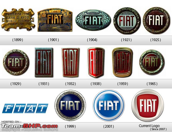 Fabbrica Italiana Automobili Torino (FIAT) was founded in Turin (1899) by a group of investors including Giovanni Angelli who later became the Managing Director of the company. At this time a poster was created to celebrate the event, and the company name in the top left corner of the poster became the companys first logo. In 1901, the company changed its logo to a brass plate with the name FIAT in the centre. The logo had a characteristic A which has remained unchanged till date. In 1925, the FIAT logo became circular, from an oval shape in 1904. The laurel wreath around the circle was to celebrate the companys victory in first competitive car races. The shape of the logo kept changing from square to shield, and returned to a circular logo in 1999, with the characteristic A and a modern stylish laurel wreath around the circle. The current FIAT logo was launched in 2006, and was first seen on Bravo. 10. Ford 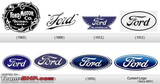 Henry Ford used to work for Thomas Edison. He founded two companies before settling on Ford. His first company went bankrupt after just two years, and he left the second company after just one year. However, the second company became Cadillac later on. His third company, founded in 1902, was called Ford & Malcomson, Ltd. He was unable to pay the bills for parts in his third company, but some investors agreed to put money in the company, and it was renamed as Ford Motor Co. This is the company name in the first logo of 1903. The 1909 logo, which has a similar font as todays logo was borrowed from Childe Harold Wills, who had made this font for his business card. In 1912, the Ford logo was given a complete makeover, as compared to the earlier simplistic design. When a car was launched in 1927, called Model A, the famous blue oval was introduced in the logo. This was the shape and color, on which all future Ford logos have been made. The Company has experimented with different shape going from ellipse to circle, and even a diamond like shape in 1957. The 1976 logo was essentially, the last major change in the symbol, and is very similar to their current logo. Finally, in 2003, the company released a new logo, which came to be known as Centennial Blue Oval. 11. Mazda  The company derives its name from a West Asian God named Ahura Mazda, the God of wisdom, intelligence and harmony. The company was setup in 1920 as Toyo Cork Kogyo Co. in Hiroshima, Japan. The company was setup to produce a cork substitute because there was a shortage of real cork in Japan during World War I. However, after the war when real cork was again available, the company failed. In 1927, Jujiro Matsuda joined the company, and it started manufacturing tools, three-wheeled trucks and finally cars. After World War II, the company registered its trademark under the Mazda brand, and the first logo was launched. The curved M in the logo was inspired from the Hiroshima city emblem. The 1936 logo had a combination of the curved M from the city emblem, and wings that represented the companys agility, speed and capability to soar to new heights. The current company logo was designed by Rei Yoshimara in 1997, and was nicknamed as the owl logo. According to the company, the new logo has the following significance : Capturing the spirit of Mazda, the stylised M evokes an image of wings in flight and symbolises the Mazdas flight toward the future. The V in the centre of the M spreads out like an opening fan, representing the creativity, vitalty, flexibilty and passion that is Mazda. The symbol as a whole expresses the sharp, solid feeling that Mazda will be seeking in all of its products. The dynamic circle symbolises our readiness to spread our wings as we enter the 21st century. Some people saw a stylized Tulip instead of the stretched wings. 12. Mercedes-Benz 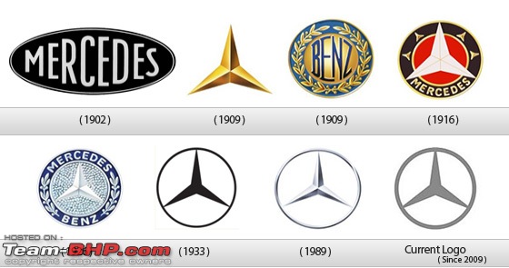 The Mercedes-Benz was formed by the merger of two car companies DMG (Daimler-Motored-Gesellschaft, founded by Gottlieb Daimler) and Benz & Cie, founded by Karl Benz. Both the companies were similar in their work and were situated in close proximity. It was after the World War I, when the German economy was shattered, that both these companies decided to from a syndicate in 1924, and then finally merge in 1926, called Diamler-Benz. In 1902, the logo for Mercedes was nothing more than the simple company name. However, it was changed to a 3 pointed star in 1909. The origin of this star came from a postcard by Diamler, where he had drawn a 3 pointed star which represented making vehicles in land water and sky. After 1926, a new symbol for Mercedes-Benz came into picture, where the original logo of both the companies was merged into one. It combined the 3 pointed star of Mercedes and the laurel wreath of Benz. Over the years, the symbol has been improved vastly in design and simplicity. It has been recognized as a symbol representing luxury and top tier cars. 13. Mitsubishi  The Iwasaki family, who started the Mitsubishi brand, lived in 1854 feudal Japan, and had to go through very tough times. When Yataro Iwasaki was in school he was called home one day because his father was injured during a dispute with the village leader. He asked a local magistrate to hear his fathers case, and when the magistrate refused, he accused the man of corruption. Yataro was promptly jailed for 7 months. After abolition of Japans feudal clan system, Yataro, acquired Tosa Clans shipping business in 1873 and named his shipping business as Mitsubishi. Later, a fourth generation Iwasaki, Kayota, turned this company into a giant corporate group, with an automobile manufacturing company called Mitsubishi Motors. The Mitsubishi logo was a combination of the Iwasaki family crest, the Tosa Clan three-leaf crest (see origin of shipping business above), and three stacked diamonds. The official translation of the logo itself is three diamonds. 14. Opel 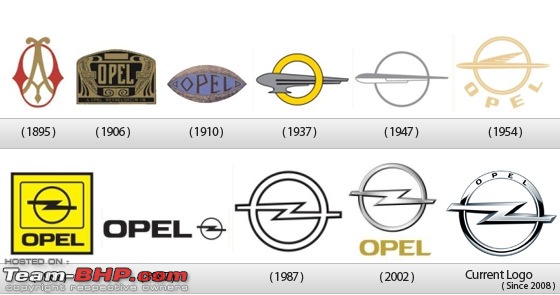 Opel is a so important historically and currently, to a large class of people, representing the quality for a mid-price category. We thought so to present to those who still not a history facts in a circle logo used by the company of great importance in Europe. The founder of the Opel factory sewing machines, Adam Opel died in 1895. His sons bought Lutzmann company and produced the first Opel car in 1898. On the right you see first company logo Adam Opel, a manufacturer of sewing machines. In 1900 they began to import and Renault cars and Darracq, which purchased and a production license. During the company has adapted a logo Art Deco since 1906. After 1906, there are many version of opal logo introduced and from 2002 to today is just a bit modernized version of 1987, complying with the 3D design style of this era. With the introduction in 2008 of the Insignia which reached the 2009 Car of the Year worldwide, the company introduced a new logo to strengthen brand image. The new logo received in addition to the previous logo, OPEL inscription in the upper part of the circle. 15. Peugeot  Peugeot, a major French car brand was started by two brothers Jean-Pierre and Jean-Frédéric Peugeot in 1812. The company was a steel mill for decades, making different products like machine tools, crinoline dresses, umbrellas, wire wheels, irons, sewing machines, kitchen gadgets. In 1855, the company started making bicycles and was one of the largest bicycle manufacturers in France. The company entered the automobile industry due to its bicycle manufacturing business. In 1889, Armand Peugeot created the companys first car which was run by a steam powered engine. After meeting Gottlieb Daimler, the company replaced the steam engine with a gas powered internal combustion engine. The Peugeot lion logo was based on the flag of the Région Franche-Comté, designed by a jeweler Justin Blazer in 1847. Earlier, the logo was used on the companys kitchen gadgets, to denote the signature quality of their steel, and was introduced on cars only after Armand could convince his family, that cars could be a profitable business. 16. Porsche  Porsche, a German manufacturer of luxury high performance automobiles, was started as a company called Dr. Ing. h. c. F. Porsche GmbH by Ferdinand Porsche. Initially the company didnt build any cars under its own name and offered consultancy for motor vehicle development. This company is known for designing the first Volkswagen car, Volkswagen Beetle. Ferdinand turned this company into Porsche in 1931, but the first Porsche car wasnt introduced till 1939. In 1950s Dr. Ferdinand, set about developing a company logo to denote their location in Stuttgart and a dynamic, powerful image. After several draft versions, a logo created by Porsche engineer Franz Xaver Reimspiess was decided as the company emblem and has become the trademark of the company. The rampant house in the centre was derived from the city seal of Stuttgart, and was a symbol of forward thrusting power. Unfortunately, Ferdinand died in 1951, before the company shield first appeared on the Porsche 356 model in 1952. The logo first appeared in the centre of the steering, and started appearing on the bonnet of 356 from 1955. In 1959, the shield appeared on the wheel-caps too, allowing the sports car to be recognized from the sides to. The Porsche shield has remain unchanged over the years, and still appears on the steering, bonnet and the wheel-caps. 17. Renault  Louis Renault, the founder of Renault, produced his first car in his own backyard when he was 21 years old. When he started receiving orders from companies to build more cars, he started the Société Renault Frères Company with his brothers and friends in France (1898). Renaults first logo introduced in 1900 featured the initials of the Renault brothers: Louis, Ferdinand and Marcel. In 1906, the logo was changed to a front end of a car, enclosed in a gear wheel. During the First World War, Renault produced light tanks for the Allies. Renault changed its logo to a tank after the war due to the popularity of its tank, Renault FT-17. The diamond shape, which appears in the company logo till date was first introduced in 1925. Victor Vasarely designed the modern Renault logo in 1972. 18. Rolls Royce  Charles Stewart Rolls and Henry Royce founded the Rolls Royce Limited in Britain (1906). The company manufactured automobiles and aircraft engines. In 1973, the Rolls Royce Motor Company was separated from the parent company, which was nationalized following a huge crisis in 1971. In 1884, Henry Royce, One of the founders of Rolls Royce, started an electrical and mechanical business. He made his first car, a two-cylinder Royce 10, in his Manchester factory in 1904, and was introduced to Charles Rolls at the Midland Hotel in Manchester on 4 May of that year. They both agreed to create a company that would later go on to manufacture the best car in the world. The name of the company Rolls Royce derives from the surnames of the company founders, Henry Royce and Charles Rolls. In 1971, the company and subsequently the brand were split. Rolls-Royce plc, the owner of the famous Rolls-Royce trademarks, initially granted permission for use to a newly formed entity, Rolls-Royce and Bentley Motors Ltd. In 1998, this license was withdrawn when the motorcar trademarks were sold by Rolls-Royce plc to a BMW company, now known as Rolls-Royce Motor Cars Ltd. This company today manufactures luxury automobiles and accessories in the name of Rolls-Royce from its headquarters in Goodwood, England. Its identity system and brand are consistent with the original principles of the company founded over 100 years ago. 19. Saab 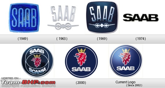 Saab, the automobile manufacturer, started as an aircraft company back in 1937. In 1937, to meet the needs of the Swedish Air Force, Svenska Aeroplan Aktiebolaget (Swedish Aeroplane Limited or simply SAAB) was created. After the Second World War, SAAB company started manufacturing automobiles to diversify its business. In 1947, the SAAB Automobile Company was incorporated, and the first manufactured car was named as SAAB 92 (because it was the companys 92nd design, all previous designs were aircrafts). The griffen logo, featuring the head of a mythological beast that had a body of a lion and head and wings of an eagle, came from Vadis-Scania, a truck manufacturer that merged with SAAB (airplane) company. The griffen was a coat of arms of the province Scania. In 2000, SAAB Automobile Company was acquired by General Motors (100% stake) and just a week ago (Feb 23, 2010) GM announced that it has completed the sale of Saab to Spyker Cars NV. Simply put, from the of announcement, Saab is part of Spyker and the new life for the troubled Swedish brand begins. To make things even clearer, GM announced the wind down of Saab operations has ended. 20. Skoda  Skoda, is an automobile manufacturer based in Czech Republic. It became a subsidiary of the Volkswagen Group in 1991. The company was started as a bicycle manufacturing company back in 1890s. Vaclav Laurin and Václav Klement started a bicycle repair shop in Mladá Boleslav (1895), and later they started a bicycle and motorcycle manufacturing factory in 1898. The companys first logo was based on the Slavia brand, with lime leaves, to represent the Slav nations. The logo also included the owners names which later became the main foundation for future logos. In 1905, L&K logo (initials of the owners) was designed and was influenced by Art Nouveau, an artistic style at the beginning of the 20th century. From 1926, the cars were produced under the brand name Skoda, which is reflected in the oval shaped logo of the company. The laurels enclosing the brand name were retained in the new logo as well. The famous winged arrow logo was first introduced in 1926, but its origin and designer is unknown. This was merged with the Skoda brand logo and the new logo was used on cars from 1994. The black and green logo, gives the Skoda brand a great degree of originality. The black color symbolizes the companys 100 years tradition, and green color signifies the environment friendly production of Skoda cars. 21. Volkswagen  Volkswagen means Peoples car in German. The history of the company is tied with Adolf Hitler. Before the rise of Hitler, the German economy was in a very bad shape; as a result people couldnt afford to buy cars. In 1933, Hitler raised the idea of an inexpensive car in the Auto show. In 1934, Ferdinand Porsche met with Hitler to design the car. Hitler gave him all the specifications of the car and Porsche promised to deliver the design. In 1937, the Gesellschaft zur Vorbereitung des Deutschen Volkswagens mbH was created (it became simply Volkswagenwerk GmbH a year later). In 1938, Hitler opened a state funded Volkswagen factory in Walburg. It was suppose to produce commercial cars, but it was used to churn out military cars. It was only later found that Hitler had intended to use the Porsche car as a military vehicle only, which could carry 3 men and a machine gun. After the WWII, Britishers took over the company. They renamed the car as Beetle. Surprisingly all the car makers like Fiat and Ford declined to take free control of the Volkswagen factory. So, it was returned to the German government, and went on to become one of the worlds bestselling cars ever. The first logo was designed by Franz Xavier Reimspiess, a Porsche employee during an office logo design competition. The main part of the logo hasnt changed much, but understandably after the WWII, they got rid of the design around the circle which seems to be inspired from the Nazi flag. I love the colors that were added in 2000, to the logo which was built after WWII, it depicts a positive change in the company and the ability to adapt to the new millennium. 22. Yamaha  Yamahas logotype, featuring the combination of the tuning fork mark and the Yamaha logo, was established in 1967 when the tuning fork mark was standardized. Following a period in which the tuning fork mark was not used, the company unified the logotype to the one used today. The Yamaha brand has its roots in the name of our founder, Torakusu Yamaha. Familiar with western science and technology from his youth, Yamaha initially found employment repairing medical equipment. This led to a request to repair a organ, a project that resulted in the birth of the Yamaha brand. The three tuning forks of the Yamaha logo mark represent the cooperative relationship that links the three pillars of our business technology, production, and sales. They also evoke the robust vitality that has forged a reputation for sound and music the world over, a territory indicated by the enclosing circle. The mark also symbolizes the three essential musical elements: melody, harmony, and rhythm. In 1967, The Yamaha logotype was established but in 1980 The Yamaha logotype was revised. A design using simple lines (the current special version of the logo) was established as the standard version of the logo. Then in end of 1987, The Company changed its name to Yamaha Corporation to mark the 100th anniversary of its founding. To emphasize the Yamaha name, the tuning fork mark was eliminated but again in 1998 the tuning fork mark comes into picture. The current standard version of the Yamaha logotype (upper line) and special version (bottom line) were established. There is a slight differences between the Yamaha logotype and that of Yamaha Motor. Yamaha Corporation uses a Yamaha Logomark with the tips of the tuning forks contained within a circle. And an M with a middle column shorter than the outer legs, and features YAMAHA printed in an asymmetric font. The logo of Yamaha Motor Co., Ltd. is printed in a symmetrical font and uses red as its corporate color, while Yamaha Corporation uses violet. There are many talking about why Yamaha changed its color from blue to red. The one which we believes that Yamaha motors want to match the logo color with Yamaha Japans corporate color. Source: Link.  The Ferrari logo consists of a symbol of Prancing Horse on a yellow back ground, usually with the letters SF. SF stands for Scuderia Ferrari. The Ferrari logo is well known and well recognized by all and especially the fans of motor car racing. The Ferrari logo consists of a symbol of Prancing Horse on a yellow back ground, usually with the letters SF. SF stands for Scuderia Ferrari. The Ferrari logo is well known and well recognized by all and especially the fans of motor car racing.The name of Ferrari and its Logo bring to our mind emotion that we feel about speed and sports cars. In 1940 Enzo Ferrari inherited the prancing horse badge for World War Ones legendary ace of Italian Air Force Count Francesco Baracca. Ferrari Logo History The Prancing Horse was a symbol used by Count Francesco Baracca, who was an ace fighter pilot of Italian Air Force during World War 1. He died young, fighting fearlessly. He was shot down after 34 dual and team victories. Count Francesco Baracca used the Prancing Horse symbol at the sides of his plane. On June 17, 1923 Enzo Ferrari met Baraccas mother Countess Paolina, after winning a race at Savio track in Ravenna.  Countess Paolina suggested that Enzo should use the symbol of prancing horse, as it would bring good luck. It was not until 1940, that Enzo Ferrari began to use the symbol, which later on became the part of the world famous Ferrari logo. Symbol of prestige Enzo Ferrari, used the symbol of the horse on his cars. He added yellow background and alphabets SF to the Ferrari logo. Since then whatever happened is history. Design Elements of Ferrari Logo: The prancing horse is now the emblem of the Ferrari logo, depicting power. Human minds instantly feel about speed and sports cars when they consider Ferrari logo. It is obviously a sign of grand victory for the company to have such an imposing and distinguished insignia. Shape of Ferrari Logo: Ferrari logo consists of the eminent prancing horse that has highlighted the grace of the logo design throughout the companys journey. It was initially considered to include the prancing horse of the Ferrari logo to bring good luck for the car racer. The Ferrari logo design is comprised of a rectangular structure holding the prancing horse inside it elegantly. Color of Ferrari Logo: The prancing horse in the Ferrari logo is colored in the black, which explains the ability of the sports cars. However, yellow tint is used for the background of the Ferrari logo that makes it look luminous from a distance as well. On the top of the Ferrari logo green, white and red stripes are employed which enhances the magnificence of the emblem. Font of Ferrari Logo: Initially, the Ferrari logo had the alphabets SF inscribed on it beautifully. But now the Ferrari logo encompasses the Ferrari signature at the bottom. The name is written in a stylish manner in Ferrari logo, reflecting the corporate side of the company.   Sources : Various websites and blogs on the internet. Last edited by GTO : 28th September 2011 at 11:09. Reason: Merging as per your request |
| |  (15)
Thanks (15)
Thanks
  |
| The following 15 BHPians Thank Racer_X for this useful post: | amitwlele, anjan_c2007, azeemhafiz, hdnivara, ilangop, jeepster, JustCause, NikhilB, SPIKE ARRESTOR, suhaas307, Swanand Inamdar, theragingbull, vinjosep, vivek_vt, _raVan_ |
| |
| | #2 |
| Senior - BHPian Join Date: Feb 2010 Location: Pune
Posts: 1,251
Thanked: 343 Times
| Re: Corporate Brand Logo Evolution of Automobile Groups @Racer_X - Superb thread. I am still to go through the entire write up and have seen only the pictures. Have you done all this research and created the collage of logos across years? Thumbs up for this effort.  |
| |  ()
Thanks ()
Thanks
 |
| | #3 |
| BHPian Join Date: Jul 2011 Location: Venice of East
Posts: 786
Thanked: 1,284 Times
| Interesting thread. But due to the team-bhp.com logo in the lower left part of the image, Some logo's are shown without their year. Pls rectify. BTW quite amused to note Porsche had prancing horse(ferrari) as it logo. Last edited by Technocrat : 12th September 2011 at 22:06. |
| |  ()
Thanks ()
Thanks
 |
| | #4 |
| Team-BHP Support  Join Date: Sep 2010 Location: All over!
Posts: 7,609
Thanked: 18,324 Times
| Re: Corporate Brand Logo Evolution of Automobile Groups Wonderful thread! Small correction : The Skoda logo changed this year i.e. 2011. Source for image : skoda-auto.com Last edited by libranof1987 : 8th September 2011 at 17:55. |
| |  ()
Thanks ()
Thanks
 |
| | #5 |
| Senior - BHPian | Re: Corporate Brand Logo Evolution of Automobile Groups Racer_X what a compilation, you have just re-written history. Amazing thread. Superb research and a splendid start. Maybe subsidiaries can also be included and how/whether the parent influenced the same can also be seen. |
| |  ()
Thanks ()
Thanks
 |
| | #6 |
| Senior - BHPian Join Date: Jan 2011 Location: Chicago, IL
Posts: 1,644
Thanked: 586 Times
| Re: Corporate Brand Logo Evolution of Automobile Groups RacerX: What a lovely writeup. I am yet to read the entire article. Went through the pictures only. Great research done there. Did you manage this all by yourself? Just one minor correction, which @Libranof1987 pointed out correctly. Do you plan to add more to the list? |
| |  ()
Thanks ()
Thanks
 |
| | #7 |
| Senior - BHPian | Re: Corporate Brand Logo Evolution of Automobile Groups Racer_X What a fanatastic writeup, great complilation. I am yet to go through the wordings, just glanced the pics first. If possible can you add our own MS and Tata to the list, would love to see their logos. Cadillac has gone through 22 times the logo change.  Rated the thread 5 stars. |
| |  ()
Thanks ()
Thanks
 |
| | #8 |
| BHPian Join Date: Apr 2010 Location: Bengaluru
Posts: 558
Thanked: 516 Times
| Re: Corporate Brand Logo Evolution of Automobile Groups Post deleted by the Team-BHP Support : Please do NOT post one-liners that add little or no informational value to the thread. We need your co-operation to maintain the overall quality of this forum. Please read our rules before proceeding any further. Last edited by GTO : 9th September 2011 at 19:52. |
| |  ()
Thanks ()
Thanks
  |
| | #9 |
| Senior - BHPian Join Date: Nov 2009 Location: Los Angeles
Posts: 1,187
Thanked: 168 Times
| Re: Corporate Brand Logo Evolution of Automobile Groups Brilliant thread man! Very well detailed and highly knowledgeable! Rated a well deserved 5 star. The Skoda logo is the previous generation though. Libran has uploaded the present logo. |
| |  ()
Thanks ()
Thanks
 |
| | #11 |
| BHPian Join Date: Jul 2011 Location: Gurgaon
Posts: 423
Thanked: 721 Times
| Re: Corporate Brand Logo Evolution of Automobile Groups Fantastic thread. Must have taken you days to painstakingly compile all this info. Pedant alert: Ahura Mazda is the supreme god of Zoroashtrianism -- not just any West Asian god. |
| |  ()
Thanks ()
Thanks
 |
| |
| | #12 |
| Senior - BHPian Join Date: Jul 2009 Location: Pune
Posts: 1,074
Thanked: 660 Times
| Re: Corporate Brand Logo Evolution of Automobile Groups Excellent write up Racer_X! Rating the thread 5*'s. Also, do keep updating your first post itself with new information as and when it is available with the help of mods  Missed Ferrari and Lamborghini though Missed Ferrari and Lamborghini though  |
| |  ()
Thanks ()
Thanks
 |
| | #13 |
| BHPian | Re: Corporate Brand Logo Evolution of Automobile Groups @Racer X Thanks for the nice thread and lot of great info. A small correction in the Mercedes Benz logo. From 2010 the corporate logo was changed to the below version.  Last edited by jaguar.runs : 28th September 2011 at 10:47. |
| |  ()
Thanks ()
Thanks
 |
| | #14 | ||
| Distinguished - BHPian  | Re: Corporate Brand Logo Evolution of Automobile Groups Ford switches to the new logo on the latest Ford F-150. Most people probably won't notice, but the Blue Oval is indeed different than before  Old Logo  Quote:
Last edited by volkman10 : 15th September 2023 at 12:23. | ||
| |  ()
Thanks ()
Thanks
 |
 |

