Team-BHP > Motorbikes
Register New Topics New Posts Top Thanked Team-BHP FAQ


Reply
  Search this Thread
113,465 views
Old 10th May 2014, 02:06   #31
Senior - BHPian
 
Majumdarda's Avatar
 
Join Date: Sep 2013
Location: Pune
Posts: 1,025
Thanked: 1,093 Times
Re: Royal Enfield: New Logo & key design too!

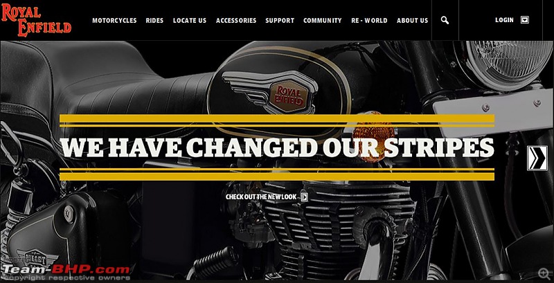
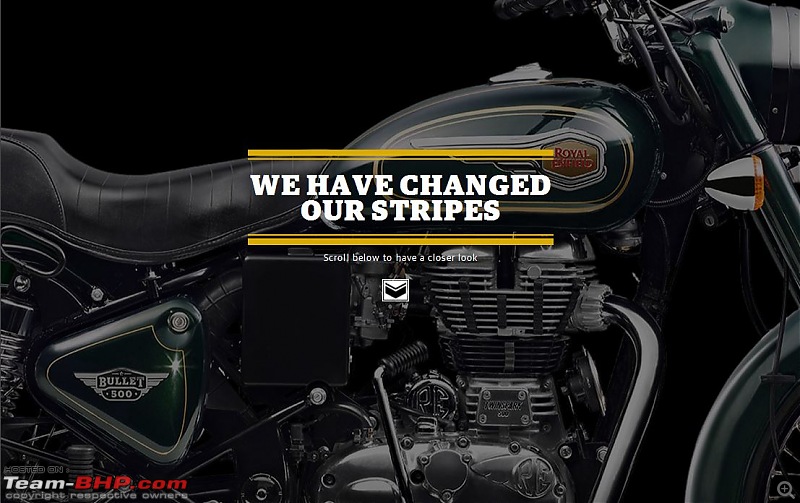
Yes, Ultimately the so called "work of art" has been updated on to the Royal Enfield Home page.

Please have a look.

Royal Enfield: New Logo & key design too!-page1.jpg

Royal Enfield: New Logo & key design too!-page2.jpg

Royal Enfield: New Logo & key design too!-page3.jpg

Royal Enfield: New Logo & key design too!-page4.jpg

I am lucky to have brought my B500 with the old vintage logo and looks


But yes, there have been some new colors which are really worth mentioning and I am sure, will be a croud puller.

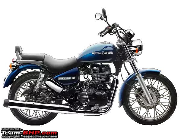
TBTS (both models) :- Midnight and Marine.
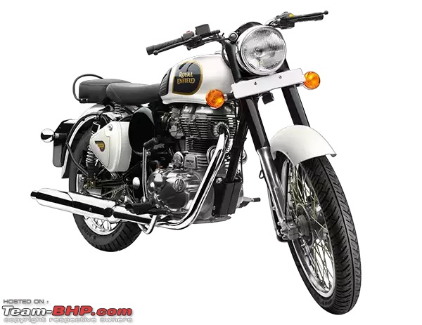
CL500 :- Classic Tan, Classic Silver. (I like the Tan more)
CL350 :- Lagoon, Ash. (yes Maroon has been discontinued)
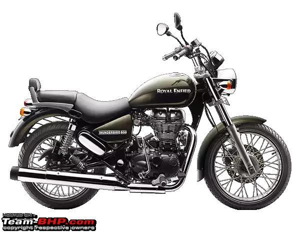
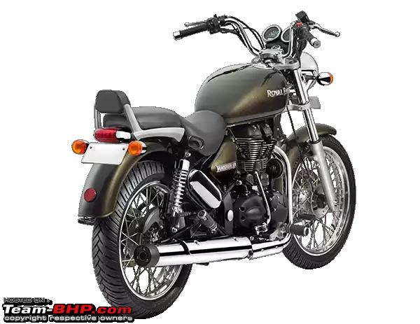
Battle Green :- Basically a CL500, but not too sure if Battle Green color is officially being rolled out in India.

Please chekck out the RE homepage [http://royalenfield.com/] for more images.

Kind regards,

Bikramjit.
Majumdarda is offline   (3) Thanks
Old 11th May 2014, 04:01   #32
Newbie
 
Join Date: May 2014
Location: Chennai
Posts: 1
Thanked: 0 Times
Re: Royal Enfield: New Logo & key design too!

A decision Royal Enfield should have taken after a discussion with the mass of Enfield enthusiasts. More than the company, its the society which put in the effort to empower this brand's goodwill.This will become a cross that Enfield enthusiasts like me will have to bear since my Bullet is due this July. I'm hoping the cosmetic changes also brings about major performance tweaks. Any news on that??
Darksoldier_ACG is offline  
Old 12th May 2014, 11:03   #33
BHPian
 
Join Date: Nov 2013
Location: Bangalore
Posts: 45
Thanked: 18 Times
Re: Royal Enfield: New Logo & key design too!

Sorry to disappoint some of the folks here, but I like the new logo much better than the old one. I grew up with a 350 (my dad's) and I feel the refreshed logo still looks vintage but refreshed. I especially like the refreshed Bullet 500 insignia. I also think the refreshed look is more American than British in terms of style
carpacman is offline  
Old 12th May 2014, 23:59   #34
BHPian
 
Join Date: Jun 2006
Location: Chennai
Posts: 36
Thanked: 37 Times
Re: Royal Enfield: New Logo & key design too!

As soon as I saw the new emblem, only thought zipped away was "Thank God, i got my CL350 before this change", but looking at it again and again, felt its not that bad. (Still, I cant accept it in my CL350)

Emblem refresh and interesting color themes should keep them moving further for another couple of years.

ASH CL350 looks funny, have to feel those with naked eye.

Now My Maroon CL350 is indeed a Classic.
raguprasad is offline  
Old 13th May 2014, 15:20   #35
BHPian
 
satyamkaushik's Avatar
 
Join Date: Nov 2008
Location: New Delhi
Posts: 281
Thanked: 137 Times

There are now two new colour options for the Classic 350 apart from the Classic Black and the Classic Silver, Lagoon & Ash.

Lagoon
:

Royal Enfield: New Logo & key design too!-image1585670072.jpg

Royal Enfield: New Logo & key design too!-image3728483377.jpg

Royal Enfield: New Logo & key design too!-image2244909253.jpg


Ash:

Royal Enfield: New Logo & key design too!-image3212599883.jpg

Royal Enfield: New Logo & key design too!-image4022166474.jpg

Royal Enfield: New Logo & key design too!-image586719048.jpg


The Classic 500 now comes with a new colour option of The Classic Tan:

Royal Enfield: New Logo & key design too!-image4218852463.jpg

Royal Enfield: New Logo & key design too!-image639404314.jpg

Royal Enfield: New Logo & key design too!-image223957526.jpg

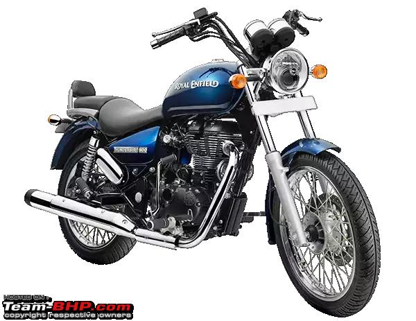
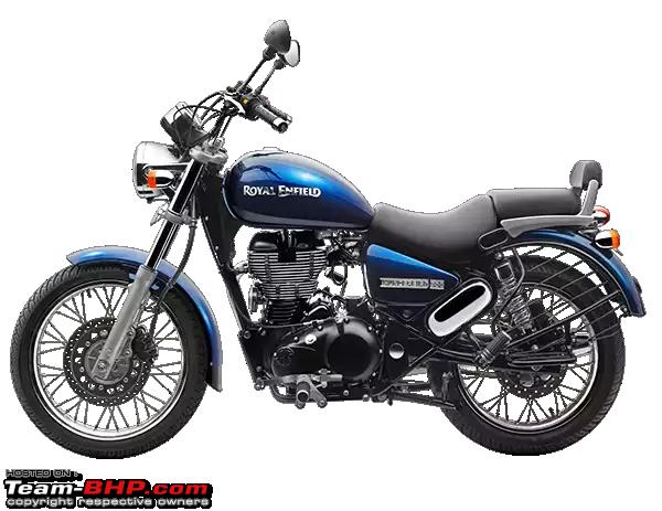
Apart from the Classics the Thunderbird 500 & 300 get two new coloursas well, Marine and Lightning :

Marine:

Name:  IMG_6592.PNG
Views: 16863
Size:  255.4 KB

Name:  IMG_6593.PNG
Views: 22880
Size:  259.1 KB

Name:  IMG_6594.PNG
Views: 82513
Size:  254.2 KB

Name:  IMG_6595.PNG
Views: 15928
Size:  248.4 KB

Lightning:

Name:  IMG_6588.PNG
Views: 15865
Size:  227.3 KB

Name:  IMG_6589.PNG
Views: 15173
Size:  213.6 KB

Name:  IMG_6590.PNG
Views: 15278
Size:  237.4 KB

Name:  IMG_6591.PNG
Views: 14519
Size:  121.3 KB

PS: All images taken from Royal Enfield's website.

Last edited by satyamkaushik : 13th May 2014 at 15:44. Reason: formatting
satyamkaushik is offline   (4) Thanks
Old 14th May 2014, 00:46   #36
BHPian
 
charanreddy's Avatar
 
Join Date: Nov 2013
Location: Bangalore
Posts: 730
Thanked: 2,198 Times
Re: Royal Enfield: New Logo & key design too!

A really bad move from RE. The vintage appeal is lost to a great degree with the new logo, especially the thunderbird. The classic looks OK though. Royal Enfield in old font looked royal , the new font looks a little goofy. Instead of concentrating on ramping up production and making bikes more reliable, all you you do is change a logo that works !! Looks like this solution emerged from a board room over a casual meeting rather than on an engineer's desk . what were you thinking ?
charanreddy is offline   (1) Thanks
Old 14th May 2014, 02:33   #37
BHPian
 
Pandher's Avatar
 
Join Date: Jun 2013
Location: Nabha
Posts: 42
Thanked: 25 Times
Re: Royal Enfield: New Logo & key design too!

I had three bullets in the past, an electra, a 350 and again a 350. I loved all of them, all were cast iron engines. I kept each for 10000 kms. RE was dead for me the moment they announced their twinspark engines. I still bought a twinspark 350 but sold it after completing 2000 kms. It just didnt have a soul no more. And now an ugly logo, i am never going to look back at RE again.
Pandher is offline  
Old 14th May 2014, 06:52   #38
BHPian
 
Rennjit's Avatar
 
Join Date: Feb 2009
Location: Namma Bangalore
Posts: 668
Thanked: 166 Times
Re: Royal Enfield: New Logo & key design too!

Reminds of the Herohonda Passion's tagline "Born in a studio, not in a factory". These bikes are very much becoming a fashion accessory. Fashion is hot than heritage so why not be. It'd be fun sighting all those colours on road
Rennjit is offline   (1) Thanks
Old 14th May 2014, 08:06   #39
Distinguished - BHPian
 
theMAG's Avatar
 
Join Date: May 2006
Location: Avon, CT
Posts: 7,217
Thanked: 1,807 Times
Re: Royal Enfield: New Logo & key design too!

This move would most likely be towards prepping up brand recall, in light of the onslaught of the foreign big boys.
theMAG is offline   (1) Thanks
Old 14th May 2014, 08:35   #40
Distinguished - BHPian
 
condor's Avatar
 
Join Date: Jun 2006
Location: Speed-brkr City
Posts: 15,864
Thanked: 16,014 Times
Re: Royal Enfield: New Logo & key design too!

Quote:
Originally Posted by Pandher View Post
I had three bullets in the past, .., all were cast iron engines. ...
RE was dead for me the moment they announced their twinspark engines... It just didnt have a soul no more.
@Pandher, you nailed it. Bullets, jeeps are two of a kind. While the jeep was able to rise again with the new engine, the same will not be applicable to a Bullet. The Bullet's life was it's engine & the looks. While the looks are being somewhat retained, the engine cannot remain the same if it had to continue to be in the market. It had to be upgraded - and when they did that, it lost it's soul.

To the classic Bulleteer, the Bullet was no longer the Bullet. Just a shell without that gunpowder ..
condor is online now  
Old 14th May 2014, 11:38   #41
Senior - BHPian
 
Majumdarda's Avatar
 
Join Date: Sep 2013
Location: Pune
Posts: 1,025
Thanked: 1,093 Times
Re: Royal Enfield: New Logo & key design too!

Quote:
Originally Posted by satyamkaushik View Post
There are now two new colour options... Thunderbird 500 & 300 get two new coloursas well, Marine and Lightning
It seems that the colors that were uploaded on the RE site as Midnight on the 10th May has been renamed as Lightning.

This is pretty strange. Either it was a genuine glitch or RE has "Midnight" in its pipeline too.

Guys, it seems that we have to check the RE page regularly now. Good idea to keep its followers engrossed
Majumdarda is offline  
Old 14th May 2014, 12:32   #42
BHPian
 
satyamkaushik's Avatar
 
Join Date: Nov 2008
Location: New Delhi
Posts: 281
Thanked: 137 Times

I am lil confused as to what exact shade is the Ash colour on the Classic 350.
It seems something like the Pearl White colour to me.
Will have to wait & see the shade in person, as there is always a difference in the actual colour shade & the colour shown on the website or on paper.
satyamkaushik is offline  
Old 14th May 2014, 13:08   #43
Senior - BHPian
 
ku69rd's Avatar
 
Join Date: Sep 2009
Location: Bangalore
Posts: 2,510
Thanked: 1,779 Times
Re: Royal Enfield: New Logo & key design too!

Quote:
Originally Posted by satyamkaushik View Post
I am lil confused as to what exact shade is the Ash colour on the Classic 350.
Mate,
Check out if you can lay your hands on the Battle Green, it is simply too good. Just came off the showroom and must admit it is fantastic. The new logos take the sheen off it though
ku69rd is offline  
Old 14th May 2014, 14:20   #44
Distinguished - BHPian
 
mobike008's Avatar
 
Join Date: Sep 2006
Location: Seattle, WA
Posts: 11,695
Thanked: 14,809 Times
Re: Royal Enfield: New Logo & key design too!

Even though RE wants to project a progressive company which it is by introducing new logos, I also concur they look way off the mark and existing simple logo that is existing from over 50 years is splendid in comparison

Some of the new colors though are smashing. Especially the blue color in 350 and TB

But, we need to understand with every change there will be resistance and it takes all of us sometime to accomodate these changes

Having said that Iam very happy for Royal Enfield and would love to see it growing leaps and bounds !!!
mobike008 is offline  
Old 14th May 2014, 15:31   #45
BHPian
 
Join Date: Feb 2014
Location: Pune
Posts: 287
Thanked: 651 Times
Re: Royal Enfield: New Logo & key design too!

People buy RE for the identity and the vintage feel, not sure how they thought changing the logos will help them retain that feel? Even if they had compelling reasons to do so - why on earth did RE chose to add curves and weight to the logos? The whole world is moving towards flatter, minimalist designs for their products. Disappointed!
Rajiv0909 is offline  
Reply

Most Viewed


Copyright ©2000 - 2024, Team-BHP.com
Proudly powered by E2E Networks