News
Your favorite car logo


In a letter or word, design or crest, it acts as a visual representation of the objects it is attached to. In the automotive world also, logo design plays a major role in the company’s brand identity.
Deadpool recently shared this with other BHPians.
A brand’s logo indicates its face and signature. In a letter or word, design or crest, it acts as a visual representation of the objects it is attached to. In the automotive world also, logo design plays a major role in the company’s brand identity. Brands go to great lengths to design logos that create an identity that will draw fans towards it even before they see the rest of the vehicle.
From American muscle to European exotics, everyone has a favorite car they would like to own one day. But do you also have a favorite car logo? Here goes my list. Please share your's.
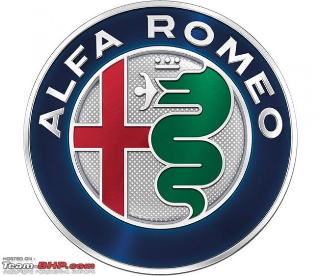
Alfa Romeo
Even a quick glance at the Alfa Romeo logo implies there's a decent story behind it, and you wouldn't be wrong. While the red cross on the left-hand-side is the symbol of Milan, home of the Italian car maker, on the right, it appears to have chosen a man-eating snake.
Otone Visconti, a knight from the former ruling family of Milan who fought in the First Crusades, is said to have taken the symbol of a serpent devouring a man from the shield of a Saracen he defeated in battle. Alfa Romeo, however, claims that the man is in fact emerging from the snake, purified and renewed, and the scene is a symbol of rebirth.
Ferrari
No list of great brand logos is complete without mention of the prancing horse. The image was first seen on the fuselage of famed Italian First World War fighter pilot Francesco Baracca, who may have taken it from his enemy’s coat of arms. Legend has it that in 1923, brand founder Enzo Ferrari met the pilot’s mother and father and was convinced that using the same pony painting would bring good luck. The yellow is a throw to Ferrari’s hometown of Modena, with a touch of the Italian flag above. The unique design of the logo has certainly brought Ferrari immense prosperity — merchandise bearing the logo makes up a large portion of the brand’s profits.
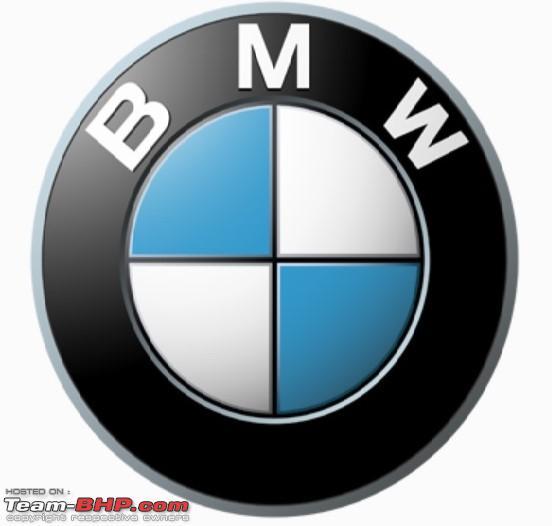
BMW
For a long time, the blue and white are often thought to be a spinning propeller, to honor BMW's aircraft-engine beginnings, but the truth is a little different. For BMW, the blue and white colors of the BMW logo symbolized the Bavarian flag colors and represented the company’s origin.
The company’s home state of Bavaria was also to be represented on the company logo. The quarters of the inner circle on the BMW logo display the state colors of the State of Bavaria – white and blue. But they are in the inverse order (at least as far as heraldic rules are concerned, where you read clockwise from the top left). The reason for this inverse order of blue and white in the BMW logo was the local trademark law at the time, which forbade the use of state coats of arms or other symbols of sovereignty on commercial logos.
Thanks to Deadpool once again! Check out BHPian comments for more insights & information.
Find Car News
Just News


_0.png)


About Us