Team-BHP
(
https://www.team-bhp.com/forum/)
BMW is getting a new logo from 2020.
Quote:
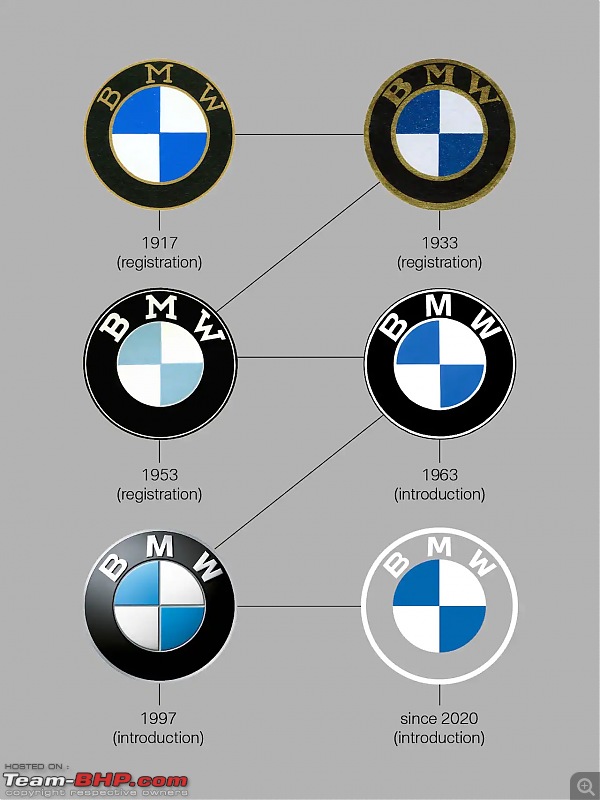
Is it a propeller or not? BMWs logo has been a hot discussion topic for decades. And all because of a publicity stunt. Learn what the BMW emblem really means, how it came to be and how the brands transformation is reflected in the new BMW logo.
|
https://www.bmw.com/en/automotive-li...-history1.html 
I can't help but wonder what has gone wrong with BMW in the recent past. Their older generation cars such as the F10/F30 look better than the current gen and the new M4 is an absolute abomination in terms of design. I really don't like the way the new logo looks, maybe it looks decent on the concepts shown in light colors but with anything else, i cant imagine it looking even have as good as it looks right now.
All they've done pretty much with the latest iteration of the logo is change the colors a slight bit. Now imagine how much it costs to start using the new logo across the board.
1917/1933 are to me the best lookers. The polished golden/brass letters stand out with classic black background, really cool.
They just diluted the logo .. hope the brand does not get diluted too.
In graphology, they say that the strength of a product / brand starts from the logo, the fonts etc. If that is true, this will not be a positive move for BMW.
Not liking the new logo one bit (personal choice) the 1997 one looked way better.
Why fix something that wasnt broken? When you have multiple other things to take care of.:Frustrati
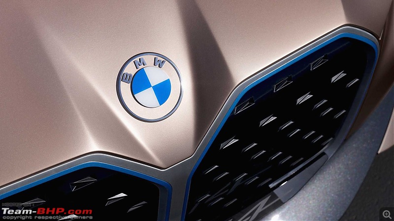
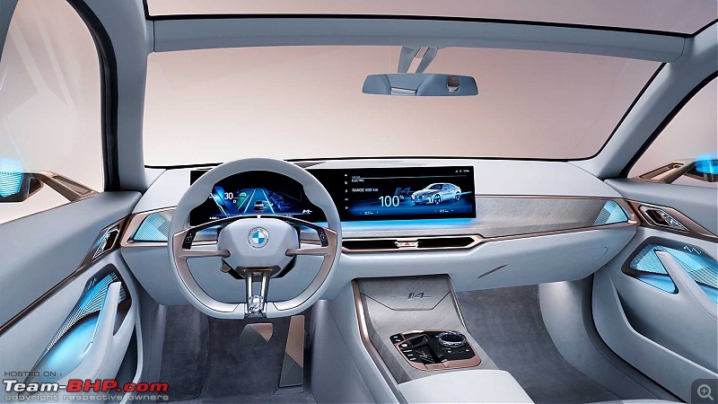
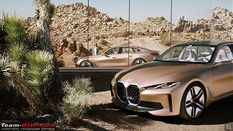
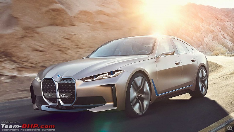
From the concept i4:
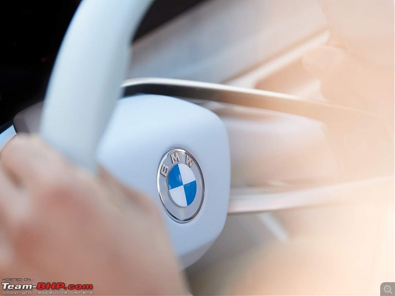

Source: BMW Facebook
Ah, it's a transparent logo now - the black has been swapped for see through. Not sure how it will look on a white (with its white fonts!!), black or silver car. A bit "retro" in my opinion. Not to my tastes, I prefer the outgoing version.
Somehow, there is nothing BMW does today that I agree with. I hate their new design language (in particular, the massive grilles), their attempts at EVs have so far been lame and now this unnecessary logo change.
Perhaps they can use this logo to add something like the spirit of ecstasy or the older Mercs.
The look of this logo is going to vary from colour to colour. It might work on a few colours but really ruin the look of the cars in others.Quite an unnecessary change for the worse in my opinion.
The last logo looked perfect for all colors. The new logo will look awkward with light colors. Looks like BMW wants the balance the logo with the new design language. They probably did not want people saying that the logo looks way better than the car itself.
The new logo looks alright, in my opinion.
I would say, it's not even one speck offensive, when compared to those baboon backsides, masquerading as grilles.
You can't have a logo that looks good when the cars look bad. It's called standardisation.
Am I the only one who noticed that the middle 'V' part of both M and W letters are not anymore aligned to the height of the whole letter!?
Since 1963, it was of the same height. A subtle, but a significant change IMO.
| All times are GMT +5.5. The time now is 17:32. | |


