Team-BHP
(
https://www.team-bhp.com/forum/)
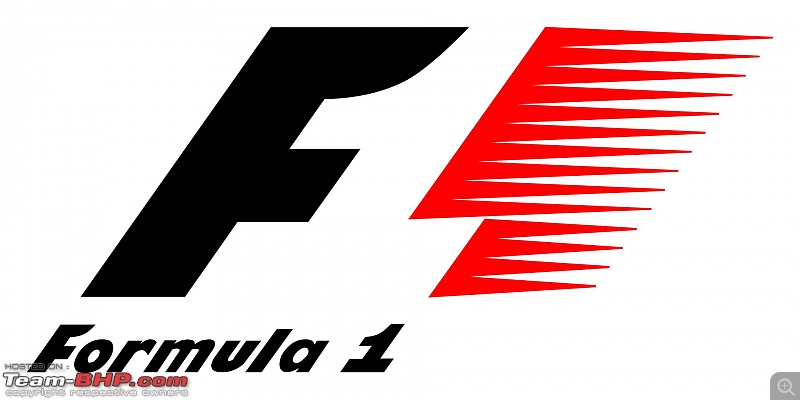
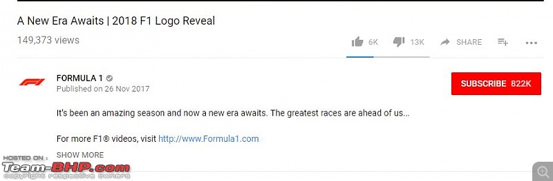
Formula 1 new owners Liberty media launched it's new logo for the sport following the end of last race of the season in Abu Dhabi in the following video.
https://youtu.be/0za98VMTPck 
We know Liberty intends to bring GP3, Formula 2, and Formula 1 more in line. It started this year with re-branding GP2 to F2 and in two years I believe GP3 becomes F3. Liberty needs a new F1 logo that the other feeder series can be designed to match.
If we believe the rumors about these series and being more consistent support series, as well as the streaming service, the logos and branding for the three need to match and make sense when displayed to anyone.
I think its good that Liberty Media are trying their best to revamp the sport, but as for the logo I honestly don't see how this design is any good.
They wanted to revamp the logo, that's fine. But it should have been an evolution of the current logo, carrying the same concept. To someone who doesn't follow F1, it will look like 'FI' instead of F1 at first glance.
Quote:
Originally Posted by Senna4Ever
(Post 4312016)
To someone who doesn't follow F1, it will look like 'FI' instead of F1 at first glance.
|
My 6 year old niece shouted 'n' on seeing the logo. Now I can't unsee it. :Frustrati
They have clearly spoiled it. This looks like something that belongs to a toy.
The old one in comparison looked fast and was intriguing. When I started watching F1, it took me a while to figure out the 'one' was hidden in plain sight. :)
Liberty should have left it alone.
Quote:
Originally Posted by Senna4Ever
(Post 4312016)
I think its good that Liberty Media are trying their best to revamp the sport, but as for the logo I honestly don't see how this design is any good.
|
At least it is the least boring of the three that was proposed!!!
Quote:
They wanted to revamp the logo, that's fine. But it should have been an evolution of the current logo, carrying the same concept. To someone who doesn't follow F1, it will look like 'FI' instead of F1 at first glance.
|
Carey's explanation "because of its use of negative space in the middle of the design. (I think it was the fact that the one was just formed out of empty space, thats what I was told.) Source:
https://www.f1fanatic.co.uk/2017/11/...w-logo-sunday/
Not sure what was wrong with the negative space, the hidden "1" conveyed speed and had no ambiguities on whether it is a numeral or an alphabets. Now we will be hearing a lot of comments on how it is "Ferrari International"
For a while let me assume that the white space is the jetwall of the original Tron Light Cycle, now redesigned to turn at angles other than 90 degrees...
The old one was iconic and much better.
Yuck - looks like the work of some amateur designer! This is change for the heck of change.
The old one is just fantastic.
I kinda like this new logo. Not as much as the old one, though, But it must be a step forward. I dont really believe that this is worse, but will only miss the old one because of the familiarity.:)
Much like the old timing boards on telly, the translucent ones which used to cover half the screen, with yellow boxed driver number.
Quote:
Originally Posted by GTO
(Post 4312178)
Yuck - looks like the work of some amateur designer! This is change for the heck of change.
The old one is just fantastic.
|
Completely agree with you, the new design looks very amateurish and no level of sophistication like the previous one, but like I mentioned, it must have been done to bring the feeder series more inline with F1. They rebranded GP2 as F2 this year and same will be happened to GP3 which will be made into F3 soon.
Similar to WRC, WRC2 and WRC3.
I atleast wish they had incorporated the number "1" in the new logo somehow.
The current one is far better. Formula 1 is the pinnacle of Motor Sports and the new logo is not reflecting that IMO.
Quote:
Originally Posted by deetjohn
(Post 4312101)
They have clearly spoiled it. This looks like something that belongs to a toy.
The old one in comparison looked fast and was intriguing. When I started watching F1, it took me a while to figure out the 'one' was hidden in plain sight. :)
Liberty should have left it alone.
|
One of Liberty Media's stated objectives was to simplify the sport. Apparently that included the logo as well. Let us hope that the rest of the simplification doesn't follow this pattern!!
Drive on,
Shibu.
Don't like the new logo at all. Looks like something that fits on hot wheels F1 range of cars.
I guess this is something that we can expect. I am not relating the change of the logo to the new groups takeover of the sport. But its going to be a lot corporate and main stream. The elite F1 that Bernie ran is gone! I guess there are pros and cons.
I don't really hate it as much as the response it has received on all platforms.
It was not necessary to change it, but this is it. And it isn't that bad.
It will just take a few races where the logo reveal is seen by everyone on their HD screens, and then slowly one starts liking it.
Just a matter of time...
I did like the logo reveal video :)
The new logo looks like a straight pick from a video game (reminds me of the Need for Speed font).
Well, it also looks like a fancy 'Fuel Injection' (FI) logo introduced on a 200cc segment bike.
In short, it sucks!
-Bhargav
What a sad, unimaginative logo! Should have stuck with the existing one. A perfect example of mending something that is not broken.:Frustrati:Frustrati
Its not just us, but the likes/dislikes on the reveal video says its all.
Here are some of the other designs they rejected. I do like some of the ones on the right side page.
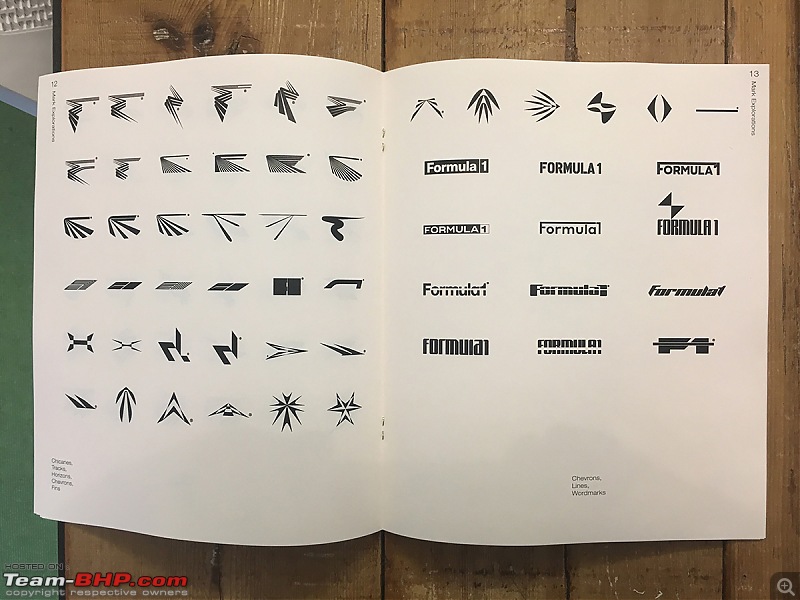
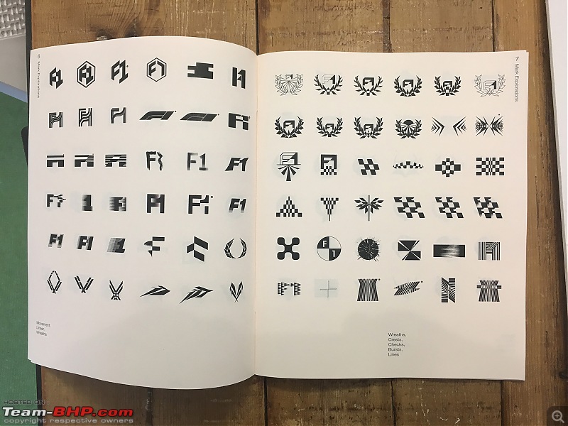
Source -
Creative Review
| All times are GMT +5.5. The time now is 10:38. | |