| |||||||

| Search Forums |
| Advanced Search |
| Go to Page... |
 |
| Search this Thread |  170,775 views |
 29th May 2012, 07:56
| #1 |
| BHPian Join Date: May 2006 Location: Mumbai
Posts: 709
Thanked: 1,711 Times
| Garmin Nuvi 50LM Review (GPS Navigation) 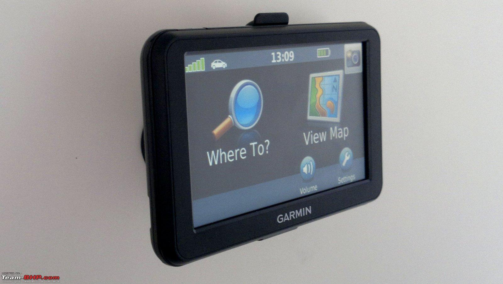 We tested Garmin’s entry level Navigation unit, the nuvi50LM. This review also applies to the nuvi40LM which is exactly similar to the nuvi50LM except for the smaller screen size (4.3” vs. 5.0”). Retail price of Garmin's entry level in-car navigation products: Nuvi 40LM: Rs. 8450 Nuvi 50LM: Rs. 9990 Positives:
Negatives:
Box Unpacking: The package contains the GPS device, a windshield mount, car charger and a quick start manual. The quality of the components is top notch and they are built to last long. The surprising bit is that there is no USB cable or a wall charger included. You will have to get your own USB cable to connect the device to the computer for data transfer as well as charging. No wall charger means the ability to plan your trip is severely limited due to the short battery backup. The compact box is tightly packed: 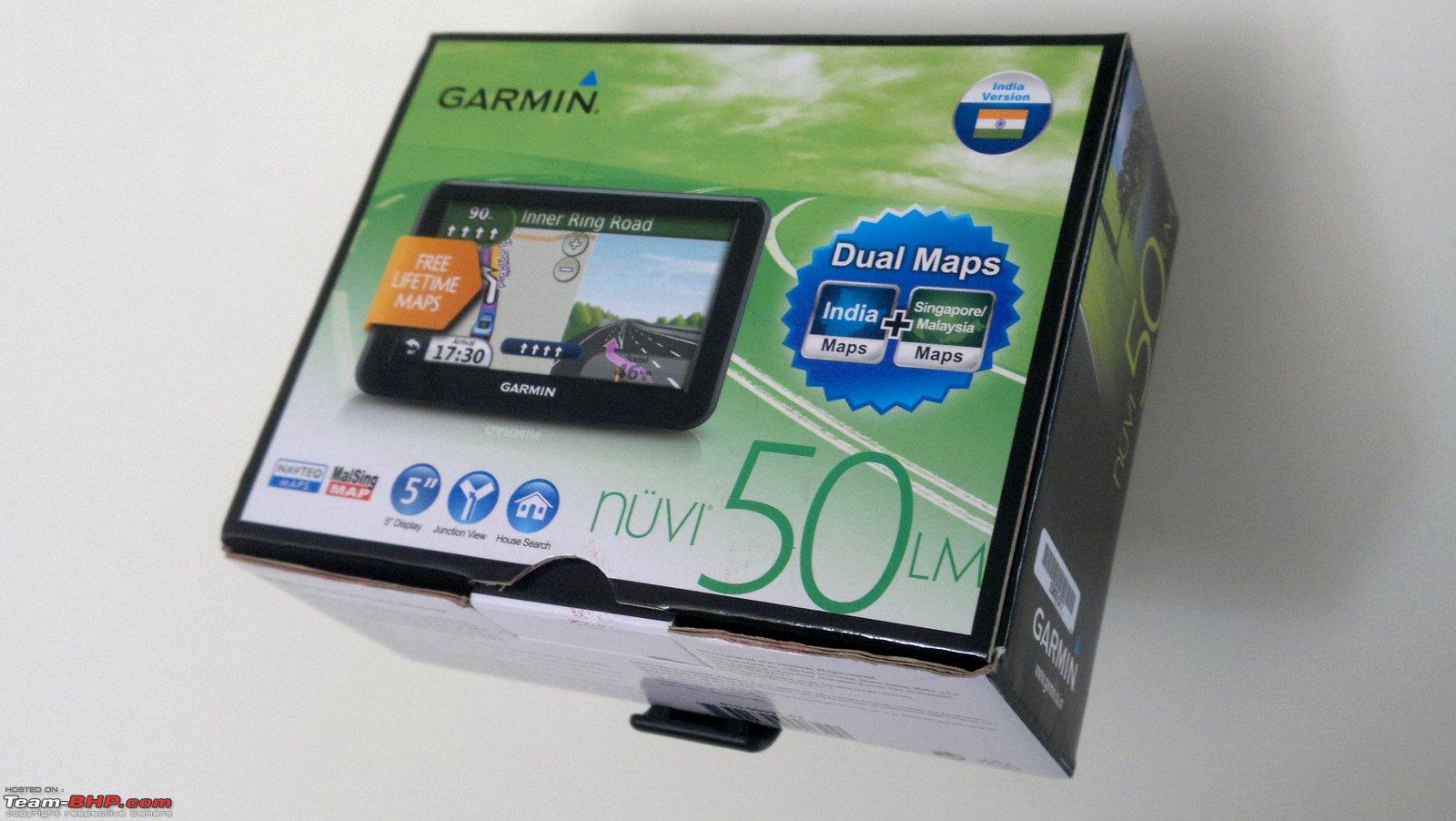 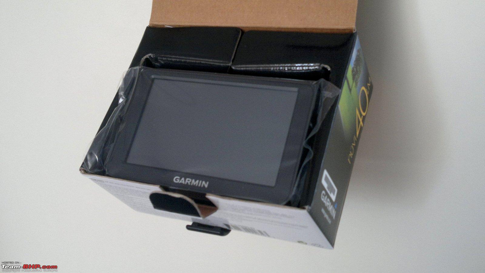  First Impressions: The device feels very solid in the hand. The build quality is impressive. There are no squeaks or other sounds when handling the device and no kind of flex what-so-ever. It just feels like it’s built to last for years to come. But the screen looks cheap when turned off. Now a days touch screens are everywhere and the contrast ratio has gone up multi fold since the old days. Our AMOLED equipped phones are capable of producing absolute black colour and thus this grey screen looks old and faded. But I would say that for the purpose of the device, the screen suffices and it does its job well. Once turned on, the resolution is just about average but it’s not an eyesore (Its 480x272 to be precise). What was surprising though is the sensitivity of the touch screen. Being of the resistive type, I fully expected to poke my nail into the screen for it to register a touch but was pleasantly surprised by its tactile response. It does not require a firm push but just a gentle tap does the trick and this makes the whole experience with the device very good. I personally feel a 5" display is more than enough for a GPS device and wouldn't even mind the nuvi40LM's 4.3" screen honestly. It all about displaying relevant information and tons of screen real estate is not a necessity for that. The back side features the speaker grill and the USB port: 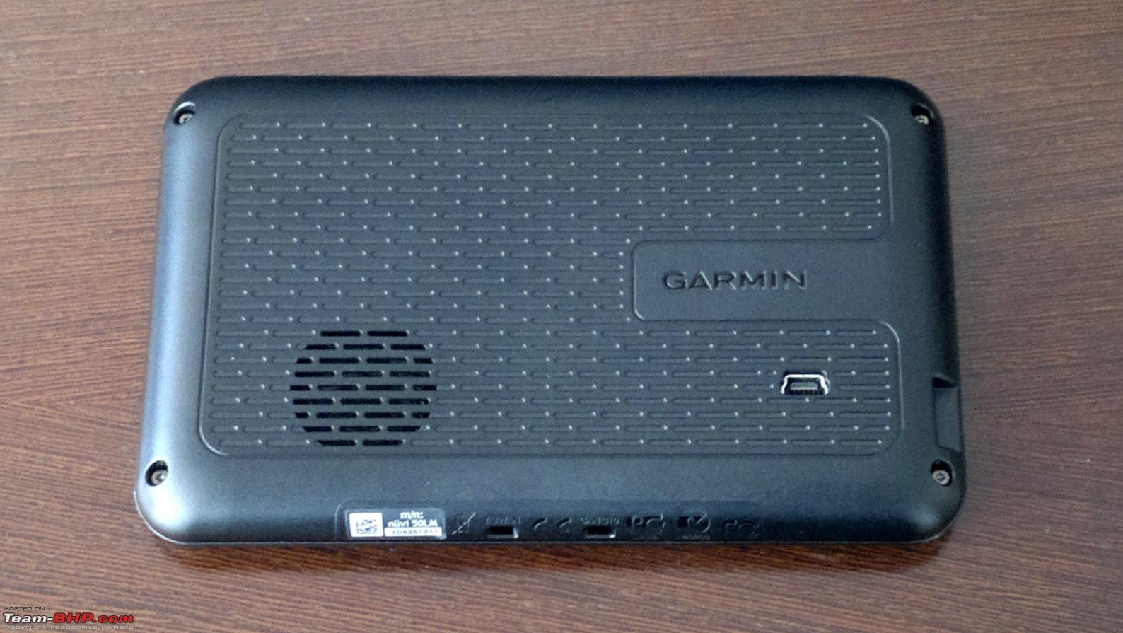 The windshield mount is very sturdy and inspires confidence while adjusting the device: 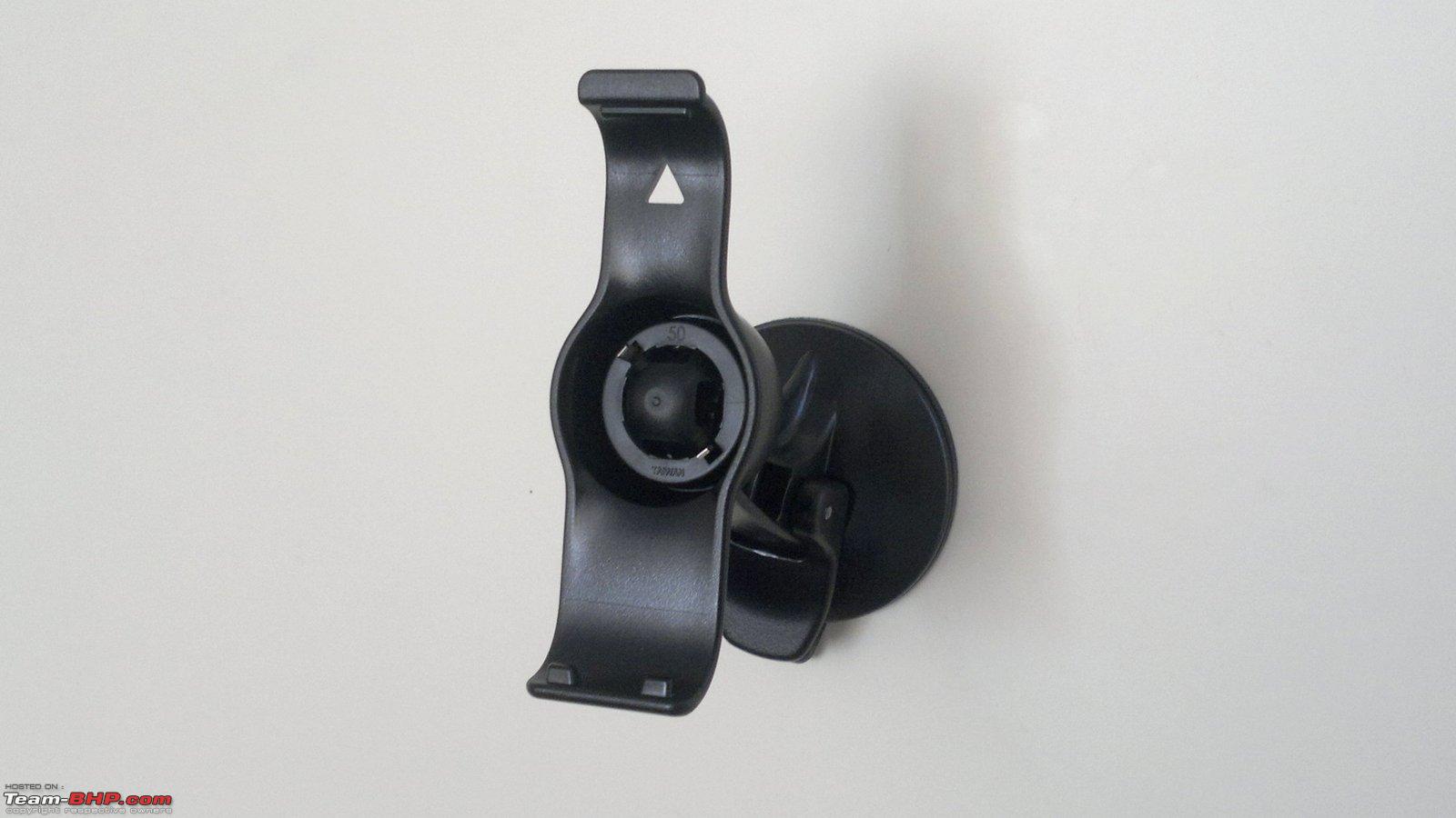 Size comparison. From L to R: Samsung Galaxy S, Garmin Nuvi50LM and Samsung Galaxy Note. The Garmin is noticeably bigger than the Galaxy S but smaller than the Note.  The Nuvi40LM on top and the Nuvi50LM at the bottom: 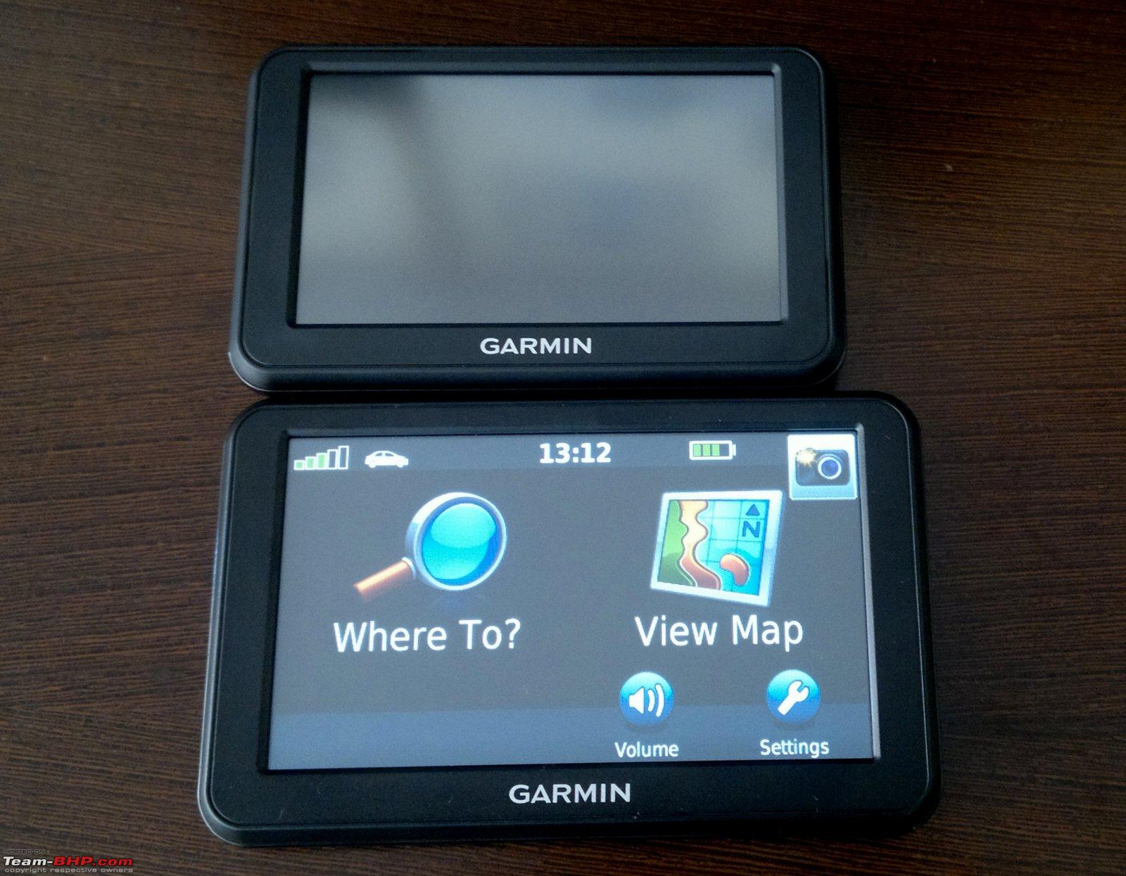 Start-up and Menu Structure: When turned ON, the device first shows a warning about not operating the device while driving, as this could be a safety hazard. This warning is displayed every time the device is started. Once past that, the first page has a very clear layout with two large icons representing 'Where to?' and 'View Map'. Things cannot get simpler than this. I am impressed with the easy of navigating the menus. Although the icons appear old-style, they do their job well and the layout is very logical and intuitive. The time taken for start-up is reasonable enough and the GPS signal is found very quickly. Most of the times the location was determined as soon as the device started-up! The warning message displayed on every start-up: 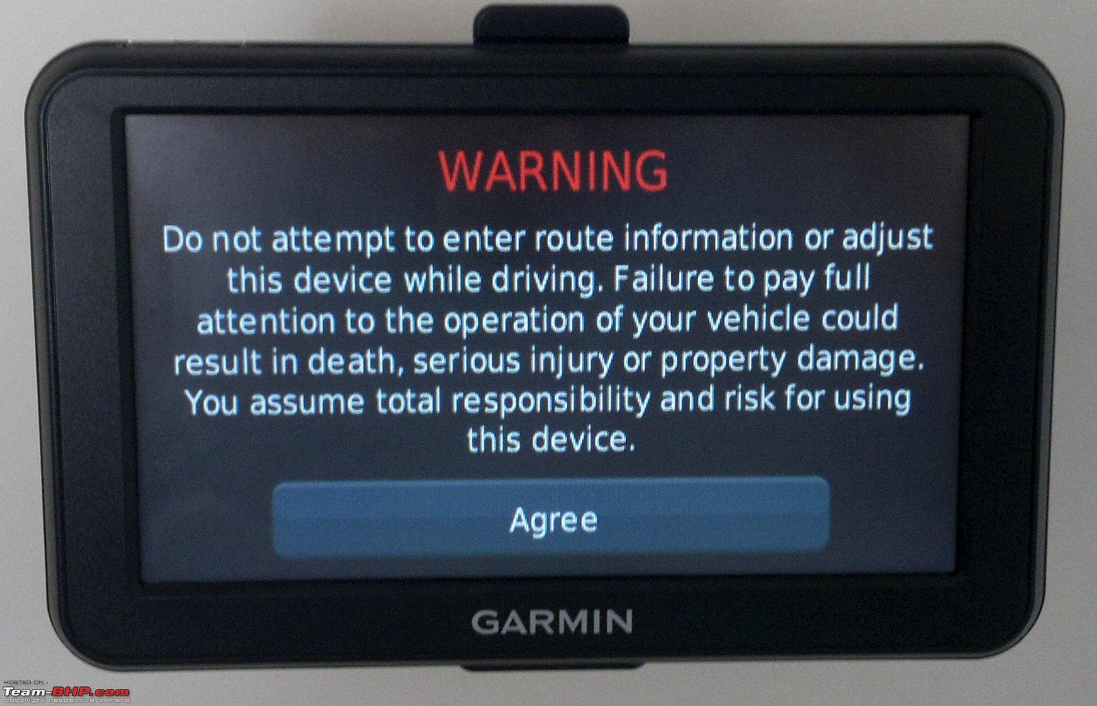 The 'Homescreen':  Clicking on 'Where to?' takes you to a sub-menu which gives various options. The most important of these are the 'Points of Interest' (POI), ‘Recently Found’ and ‘Favourites’. Clicking on POI gives you multiple categories and also a search function. Further, on selecting the appropriate category, the POIs are displayed in the descending order of distance from your current location by default. You can change this by clicking the 'Near' button at the bottom which gives you options to set the location from which the POIs and other places would be displayed in terms of distance. For example: If you select 'A recent destination' in the 'Near' menu and then select from a list of recent destinations displayed, then all the POIs, Favourites, etc. will be displayed in the descending order of distance from that location. This is a neat feature and very helpful while planning your trip. The 'Go Home' and the 'Go to Office' features are self-explanatory. Within the 'Where To?' menu:  These are the options within the Points of Interest (POI) menu:    Options in the 'Near' menu allow you to set a location from which the distances of all stored locations are displayed:  POIs displayed in the descending order of their distance from current or set location:  The 'House Search', 'Phone Number' and 'Junction' features are good but one's mileage with them will vary depending on the scenario. I never managed to find my building even though I had made sure that my building name exists in its maps database. The UI is confusing and the areas listed are not very clear (For example, 'Mumbai Metropolitan Region' is displayed in the States list rather than within the Maharashtra state list). This feature may work better in cities like Chandigarh, Navi Mumbai, etc. which are well planned and have well defined plot numbers and house numbers. But in Mumbai, I would never use it. Practically speaking, entering a nearby POI always worked for me because the POI database has excellent coverage. The phone number search feature is cool, phone numbers of a lot of POIs are stored in the database, so if you know the number of a hospital or a theatre or some other place, just searching for it will show you the desired result. The 'Junction' feature allows you to enter 2 street names and it will show you the junction where these 2 streets meet. 'Coordinates' feature will be very helpful for those who venture off road or like to play Geocaching (Geocaching - Wikipedia, the free encyclopedia). 'Travel Guide' and 'extras' require one to download stuff from the Garmin website via USB and it is available only after you register the product on the Garmin Website. Clicking on any POI or favourites takes you to a screen displaying information about that POI and options to save it or navigate to it. Further options in the 'Where To?' menu:  Within 'House Search', you are first prompted to enter the state, after which the city and the area are asked:  Clicking on a POI brings up this information window:  The 'View Map' icon takes you to the map with the current location displayed by default. You need to swipe from the left to the right to bring up a scrollable map. Clicking on any point on the map brings up a mouse-pointer and a small pop-up displaying information about that point and options to navigate to that location or to save it in your favourites. When browsing the map with the GPS switched off, an added option 'Set Location' shows up. This allows you to set the selected location as your current location and all the other features in the device then assume that point as your current location. This is especially useful when you are planning your route. On clicking on the map, information regarding the location is displayed as well as options to save it or to navigate to it:  An additional option, 'Set Location' is available when the GPS is turned OFF. This sets the selected location as the current location for all other functions of the device:  The map is very detailed but there is a lot to be desired in the way the map is displayed. When zoomed out, there is absolutely no information presented about the road names and POIs, it is just a grid of lines representing roads and it is very difficult to get to navigate the map this way with no guidelines as to what you are looking at. On zooming in, at a certain zoom level, all POIs and road names are displayed at once, and I mean ALL. It is like a barrage of information and it is difficult to even see the roads in a dense area. Zooming in further clears things up a bit but now you are so far zoomed in that it is impossible to understand the general layout of the place. I would be much better if the information displayed is progressively increased through the zoom range. For example: If at low zoom, only the main roads and important locations like railway stations are displayed, and on further zooming in, progressive less important POIs are displayed with all information displayed at the highest zoom. (Something similar to what online mapping solutions like Google Maps do) The 3 pictures below show the transition from a bare map to one filled with POI's. These are 3 consecutive zoom levels:    Last edited by Rehaan : 29th May 2012 at 16:11. |

|  (10)
Thanks (10)
Thanks
|
| The following 10 BHPians Thank jalsa777 for this useful post: | bejoy, debuda, espraveen, GTO, lambuhere1, speed kills, sumeethaldankar, Surfeus, Technocrat, vibbs |
| |
|
29th May 2012, 07:57
| #2 |
| BHPian Join Date: May 2006 Location: Mumbai
Posts: 709
Thanked: 1,711 Times
| Re: Garmin nuvi50LM Review Navigation: Clicking on 'Go!' instantly starts up navigation mode and the route is calculated within a few seconds. The navigation is pretty straight forward; the voice instructions are clear and not too intrusive. The loud speaker is pretty good and loud enough for our Indian conditions. In fact, I never felt a need to pump up to the max possible volume. The voice navigation is available in English (American, British as well as Indian Accent options) as well as Hindi. The Indian English is good, but even though its the only voice that can say road names, the pronunciation is down right pathetic. The device just can’t pronounce our road names properly and it can even get distracting at times. The Hindi is also very good, the voice is soothing and the instructions are very clear. In navigation mode: 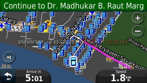 The available languages (note that only one has the ability to pronounce street names):   For route selection, there are various settings which allow you to avoid U-turns or toll-roads for example. There is an option to set whether the faster (time-wise) route or the shorter (distance-wise) route should be selected. The route selected generally is good and the device likes sticking to the main roads as much as possible. This can be a problem in the traffic congested Indian cities but that is another point all together. The default screen displays the speed and the time. Clicking on the 'time' field gives you options to choose from various display parameters as shown below. Clicking on the speed field brings up a very informative dashboard display. The various options for the time display field:  The Dashboard display (Please ignore the values as these are junk values displayed during the simulator mode):   An interesting thing is when approaching junctions, sometimes a 'Junction Display' screen pops up which gives detailed information about which exit to take. On highways, it displays which lane is to be taken; this is a very handy feature and can save last minute lane changes which can be dangerous.  Lane indicator:  Clicking on the top bar produces a list displaying the route points:  One can change the destination or add a 'via point' by clicking on the back button and following the procedure to search for a new destination. There is a 'Detour' function which provides an alternate route to the selected destination. This is useful if the road is blocked or there is too much traffic or for various other reasons. If there is no alternate route, the 'detour' icon is not displayed. The unit also offers the automatic route recalculation feature. I personally find this feature very useful as in India we frequently have road repairs, closures, etc. and thus it is sometimes difficult to follow the GPS’ directions. In such scenarios, just take the next available turn and the GPS will recalculate the route for you from your current position. (I actually had to use this feature almost 5 times during one of my trips) The detour option is displayed here:  While already navigating to a destination, selecting a new location from the POIs or map gives the option to set as new destination or add as a 'via' point:  There is an off-road mode, in which the route is shown as the bird flies. Also, the trip log feature is very helpful while off-roading as it shows the path the vehicle has been following and allows easy back tracking. Route overview:  Display while in navigation mode, note that due to a lack of compass, the device does not know your orientation until you move a little bit for it to calculate your heading:  Shows a visual warning when the speed limit of the road is breached, no audio warning though:  Last edited by Rehaan : 29th May 2012 at 15:08. |
|
| (11)
Thanks
|
| The following 11 BHPians Thank jalsa777 for this useful post: | bejoy, cmdalvi, debuda, GTO, Ikoner_03, pjbiju, speed kills, Surfeus, Technocrat, vibbs, VijayAnand1 |
|
29th May 2012, 10:04
| #3 |
| BHPian Join Date: May 2006 Location: Mumbai
Posts: 709
Thanked: 1,711 Times
| Re: Garmin nuvi50LM Review Other features: Indoor use (offline mode): There is an option to turn OFF the GPS receiver. Also, if the device cannot find a GPS signal within a few minutes of start-up, it asks whether it should continue searching for satellites or shut down the receiver. This is very useful when doing a recce for a trip especially since battery life is low at only around 2 hours. It uses the last known position as the current position. You can also set any location as the current position. From then on you can use the device as if the GPS was ON. It will show the route for a destination as well as nearby places with the set location as the start point. It can even simulate driving to a desired destination, complete with voice guidance et al. But don't believe the speeds it shows because it often goes into triple digit speeds where there is no speed limit data! Interestingly, there is no way to save a route. While this might not be important to most users, it is a big omission, especially for Commercial vehicle operators and for off-road enthusiasts. Option to set location while in 'Indoor Mode': Simulated driving with the GPS turned OFF:  Pedestrian Mode: There is an option to select between driving mode and pedestrian mode. In pedestrian mode, it neglects one-ways and prefers streets rather than main roads. It is useful for those walking or cycling. But considering the battery life is only about 2-hours, I doubt the effectiveness of this feature. Pedestrian Mode:  Satellite Information: Detailed information about the satellites in range is displayed along with the latitude-longitude, speed, elevation and positional accuracy. It even shows the position of the sun and the moon. Very informative signal data display:  Help Menu: The inbuilt help menu is very extensive. It is possible to search through the help archives too. The descriptions and instructions provided are informative and thorough. This is especially helpful since the device does not come with a full-fledged user manual. Surprisingly, even a soft-copy of the user manual is not available on the product page on the Garmin Website! In fact, I learned new things about the device every time I turned it ON. A manual would greatly help those who are not very tech-savvy and will also help users discover features much faster than by trial and error. Excellent coverage of topics by the internal help menu:  Miscellaneous Points:
I was using 2D view. But 3D view is also available.   Legibility in direct sunlight is acceptable (This picture is shot in particularly harsh and direct sunlight, such a scenario will almost never arise in the car): 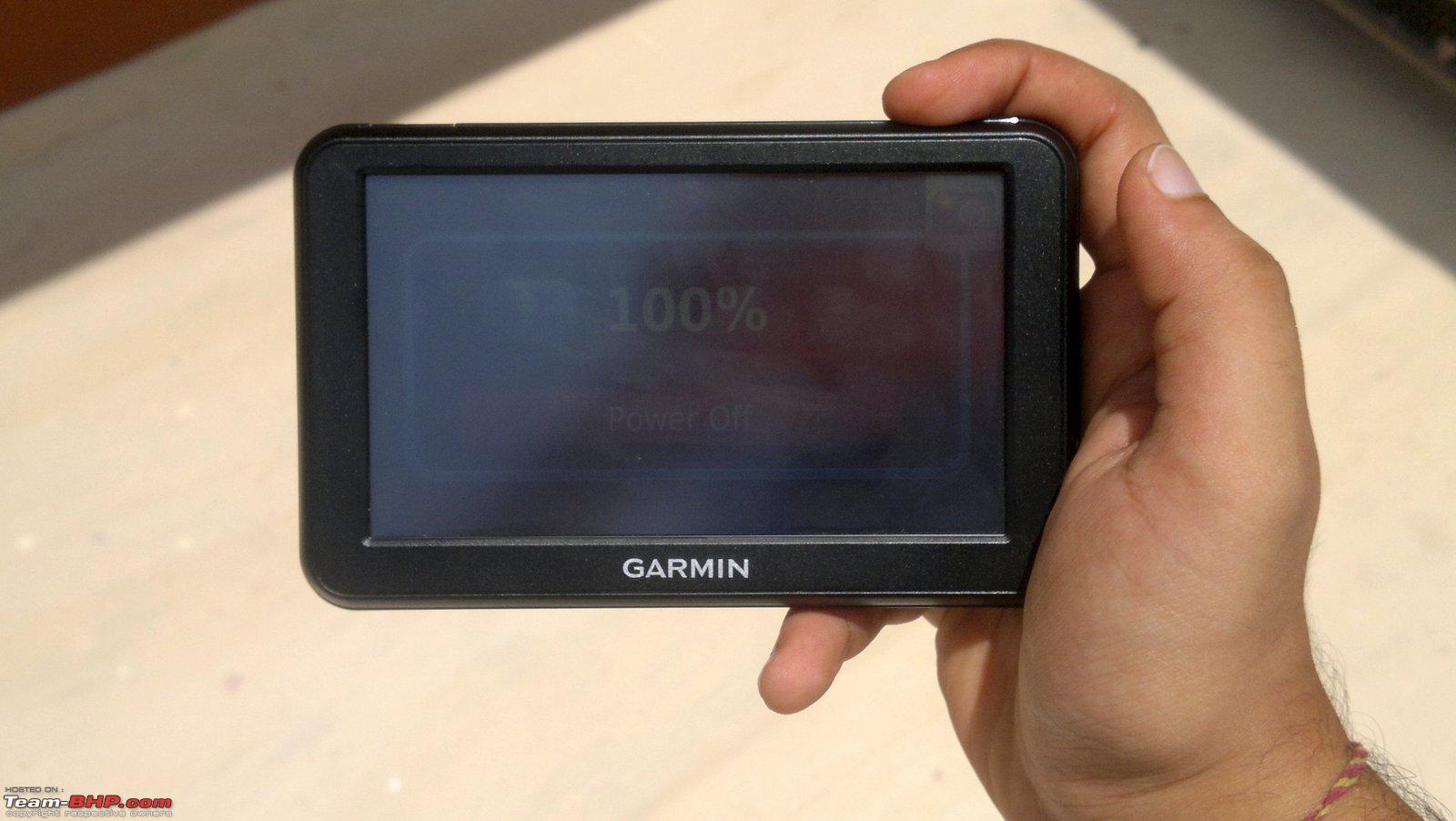 There are two more higher end models from Garmin featuring bluetooth connectivity and a host of other added features: Nuvi 2465LM: Rs. 15,990 Nuvi 2565LM: Rs. 18,990 Last edited by Rehaan : 29th May 2012 at 15:26. |
|
| (14)
Thanks
|
| The following 14 BHPians Thank jalsa777 for this useful post: | AvinashV, debuda, govigov, GTO, Ironhide, PGNarain, speed kills, SS-Traveller, surd_biker, Surfeus, Technocrat, thewhiteknight, Urban_Nomad, vibbs |
|
29th May 2012, 10:09
| #4 |
| BHPian Join Date: May 2006 Location: Mumbai
Posts: 709
Thanked: 1,711 Times
| Re: Garmin nuvi50LM Review On a related note: I just don’t see the point of owning a dedicated GPS device in this age of Smartphones. A cheap smartphone will provide all the features of this GPS device and then some. It can be used as a complete media device. While Android (Google Maps) requires one to have an internet connection to access maps and calculate routes (a big disadvantage in times of limited of connectivity), there are no such issues with Nokia phones on which you can save full country maps and full voice navigation is possible even without a SIM card. In fact, Navtech, the company which supplies maps for this Garmin device is owned by Nokia and thus the maps are equally detailed on the phone. The cheapest Nokia smart phone (Nokia 500) is now available for only Rs. 9525 and thus sits directly between the Nuvi twins. Personally, I would buy a phone just for the car and use it as a permanent navigation and media device. Advantage of phones over dedicated GPS:
Advantage of dedicated GPS devices over mobile phones:
These differences are apparent in the lower priced models reviewed here. But as we go higher up the price range, the dedicated GPS devices do make a case for themselves with the ability to connect with reversing cameras and display video feeds from them. They can also connect to your phone to enable hands free operation. Last edited by GTO : 29th May 2012 at 16:18. |
|
| (20)
Thanks
|
| The following 20 BHPians Thank jalsa777 for this useful post: | Arunshek, AvinashV, bejoy, gopikb, GTO, highway_star, Ironhide, lohithrao, mayankjha1806, PGNarain, raj_5004, saikatmandal04, Shome, sinhead, SS-Traveller, Surajit333, Surfeus, Technocrat, vibbs, Wanderers |
|
29th May 2012, 16:16
| #5 |
| Team-BHP Support  Join Date: Feb 2004 Location: Bombay
Posts: 24,208
Thanked: 36,143 Times
| Re: Garmin Nuvi 50LM Review (GPS Navigation) Thread moved out from the Assembly Line section. Thanks for sharing! |

| ()
Thanks
|
|
29th May 2012, 23:41
| #6 |
| BHPian Join Date: May 2012 Location: UK-07
Posts: 482
Thanked: 1,160 Times
| Re: Garmin Nuvi 50LM Review (GPS Navigation) Excellent review , crisp without leaving out the relevant aspects. Bravo !!  Now Garmin has truly thrown the gauntlet to MMI. Their software is intuitive though it does take some time to get used to (I can say this because I have used the Garmin Rino 530 extensively). And with Navteq maps expanding their pan-India footprint and coverage, their services and navigation experience is bound to get better. This may force MMI to offer free lifetime maps or reduce their inflated prices or else they'll see a large slice of the Navigation Devices pie going (deservedly) to Garmin India. Now Garmin has truly thrown the gauntlet to MMI. Their software is intuitive though it does take some time to get used to (I can say this because I have used the Garmin Rino 530 extensively). And with Navteq maps expanding their pan-India footprint and coverage, their services and navigation experience is bound to get better. This may force MMI to offer free lifetime maps or reduce their inflated prices or else they'll see a large slice of the Navigation Devices pie going (deservedly) to Garmin India. |
|
| ()
Thanks
|
|
30th May 2012, 09:42
| #7 |
| Senior - BHPian Join Date: Dec 2007 Location: Gurugram
Posts: 7,971
Thanked: 4,809 Times
| Re: Garmin Nuvi 50LM Review (GPS Navigation) I hope yours came with the latest (2012) maps. Otherwise upgrade the map. Link is not there on mygarmin.com but can be found on http://www.team-bhp.com/forum/gadget...s-etc-173.html The .tw site is not the best, and demands you log in to mygarmin from there using the login (not just the e-mail). I have used Garmin since 2010 (SatGuide maps) and have been very happy with the product. I think the battery life has been reduced with the new versions to make them slimmer even though it is now Lithium. Last edited by sgiitk : 30th May 2012 at 09:44. |
|
| ()
Thanks
|
|
30th May 2012, 09:55
| #8 |
| BHPian Join Date: Aug 2011 Location: Hyderabad
Posts: 128
Thanked: 92 Times
| Re: Garmin Nuvi 50LM Review (GPS Navigation) Does a Galaxy Note make GPS device redundant? What additional benefits does it have compared to the Note? (not just this GPS device... compare with any) |
|
| ()
Thanks
|
|
30th May 2012, 09:59
| #9 | |
| BHPian Join Date: May 2006 Location: Mumbai
Posts: 709
Thanked: 1,711 Times
| Re: Garmin Nuvi 50LM Review (GPS Navigation) Quote:
  | |
|
| ()
Thanks
|

|
30th May 2012, 10:22
| #10 | |
| Senior - BHPian Join Date: Feb 2011 Location: SG
Posts: 1,125
Thanked: 2,318 Times
| Re: Garmin nuvi50LM Review Wonderful review Quote:
However there is one more option. Quite a few entry level tablets are available in the market now running on android, some costing below 10K. BSNL gives one bundled with a data plan for around 4k. Then there is Micromax funbook which comes with Tata photon plus data card I suppose. If these basic Tabs have Gps (which I m not sure of), then they can very well be used for navigation by downloading Sygic from android market along with MMI maps. I had tried out Sygic-Map my India on my wives, Desire HD. With the 4.3 inch screen it did a decent job in delhi/NCR. Sygic subscription after the trial period is available of below 3 K. So if any of the devices have GPS, they can be used in conjunction with Sygic-MMI for navigation and being a tab can be used of other purposes too. Navigation does nt require internet access too after the initial downloads as the maps are saved on the device.What Say? Last edited by vibbs : 30th May 2012 at 10:24. | |
|
| ()
Thanks
|
|
30th May 2012, 10:25
| #11 |
| Senior - BHPian | Re: Garmin Nuvi 50LM Review (GPS Navigation) Jalsa, a very good review, soon you wil get the title of "review specialist"  btw, i was planning to get a "GPS navigation" but was looking for a unit which can support reverse camera aswel, does 50LM support it? Or go for a good smart phone and use it for calls and aswel for navigation, looking at a multipurpose system What you suggest? |
|
| ()
Thanks
|
| |
|
30th May 2012, 10:50
| #12 | ||
| Senior - BHPian Join Date: Aug 2006 Location: Bangalore
Posts: 1,881
Thanked: 3,072 Times
| Re: Garmin Nuvi 50LM Review (GPS Navigation) Quote:
Quote:
Last edited by msdivy : 30th May 2012 at 10:51. | ||
|
| (2)
Thanks
|
| The following 2 BHPians Thank msdivy for this useful post: | sinhead, sumeethaldankar |
|
30th May 2012, 11:08
| #13 |
| Senior - BHPian Join Date: Dec 2007 Location: Bangalore
Posts: 1,114
Thanked: 413 Times
| Re: Garmin Nuvi 50LM Review (GPS Navigation) Awesome review! I think this is the first GPS/maps in India to provide lifetime map updates. |
|
| ()
Thanks
|
|
30th May 2012, 11:17
| #14 |
| Senior - BHPian Join Date: Dec 2007 Location: Gurugram
Posts: 7,971
Thanked: 4,809 Times
| Re: Garmin Nuvi 50LM Review (GPS Navigation) I have a GPS (Nuvi 2465LM) and had a 265WT (since May 2010) before that. My Dinc2 is also pretty good at navigation and GPS. But I still want a GPS for the following reasons: 1. Running GPS on a mobile chews up the battery and is also expensive on bandwidth. The dedicated unit is quietly plugged in and does its job. 2. Dedicated GPS units are more optimised for sensitivity. 3.A mobile screen keeps on switching off so you have to 'keep in alive'. Of course a mobile is always 'there' and should have the latest maps! |
|
| (1)
Thanks
|
| The following BHPian Thanks sgiitk for this useful post: | sinhead |
|
30th May 2012, 11:23
| #15 | |
| Senior - BHPian Join Date: Aug 2006 Location: Bangalore
Posts: 1,881
Thanked: 3,072 Times
| Re: Garmin Nuvi 50LM Review (GPS Navigation) Quote:
Lifetime means life time of the device, that is till Garmin announces end of life for that device and retires it. That could be few years. No idea how many that 'few' means. | |
|
| (2)
Thanks
|
| The following 2 BHPians Thank msdivy for this useful post: | Ashokkp, GTO |
|